A few days ago I had the Epicentral+ app running on my iPad sitting on my desk and saw an event come on the screen. By looking at what stations were measuring ground movement first, second, third, etc. I could make a good guess at the event's location. Did you know that, with the data from a single seismic station, you can begin to guess the epicenter?
Generally earthquake locations are performed using many stations and algorithms that have been tweaked for years as we want to get ever more accurate locations. The USGS does this location for many events every day. It's fun to keep a live feed of the global seismic data up and look at the patterns. This is possible thanks to applications like "Earth Motion Monitor" and "Epicentral+", both products of Prof. Charles Ammon. They are worth installing and having a look. Prof. Ammon has seen the value in being able to watch signals for long periods of time: you begin to pick out patterns and get an intuitive feel for the response seen due to different events. While I don't have nearly the amount of insight possessed by experienced seismologists, I wanted to show you a quick and simple way to figure out about how far an event was from a given station. If you combine that with some geologic knowledge of where plate boundaries are, you can likely narrow down the region and earthquake type before anything comes out online.
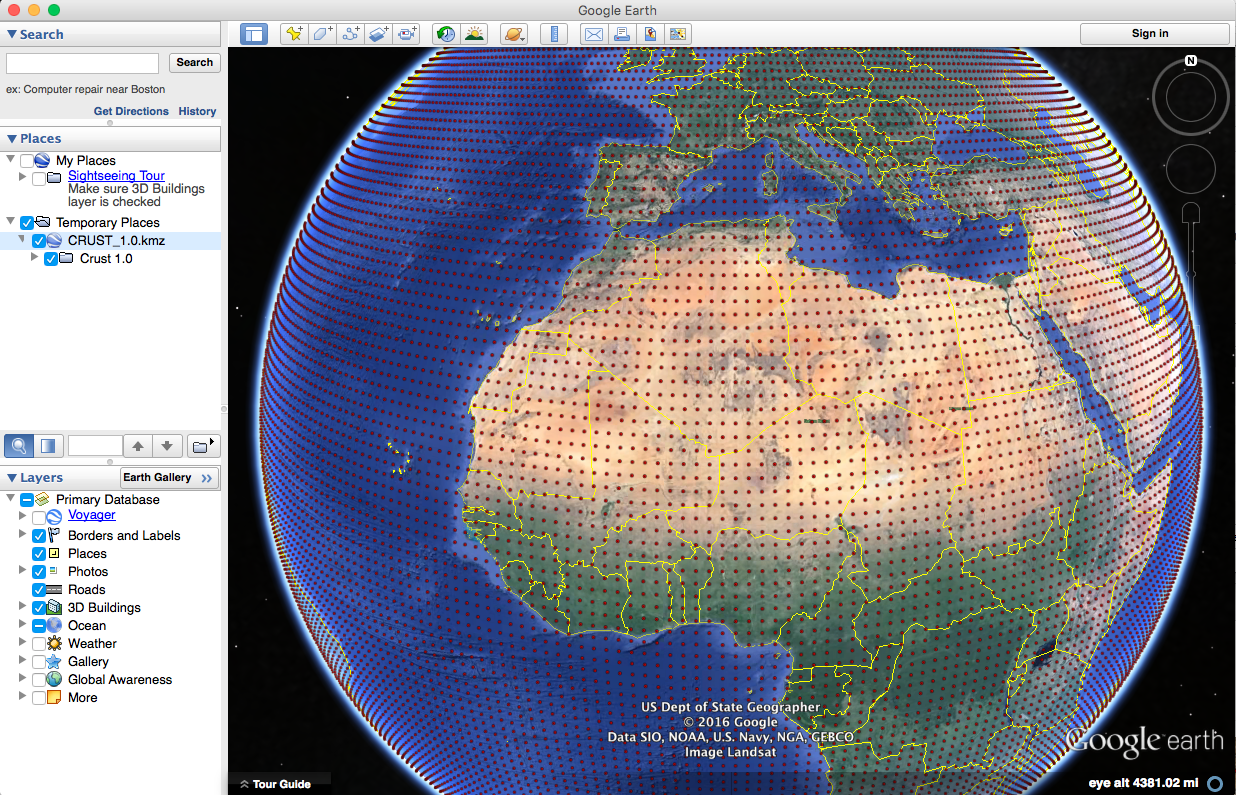
The event I saw is a pretty small event, a magnitude 5.8 near the Fiji islands; it'll work for our purposes and not provide too much distraction. I've marked it with a white star on the map below (a Google Earth map with the USGS plate boundary file). This event occurred near the North New Hebrides trench, part of a slightly complex zone where the Australian plate is being pushed under, or subducted, beneath the Pacific plate.
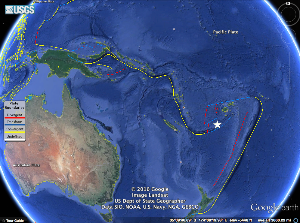
Our earthquake in question marked with a white star near the North New Hebrides trench.
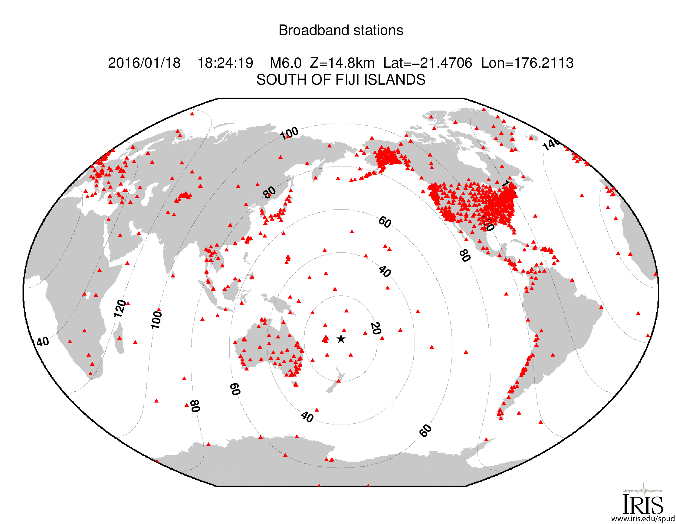
Though the event was not huge, it was detected by many seismometers around the globe. In fact, there is a handy map of the stations with adequate signal automatically generated by IRIS. The contour lines on the map show distance from the event in degrees (more on that later).

Stations and their distance from the earthquake. (Image: IRIS)
I saved an image of assorted global seismic stations about an hour after the event occurred. You can see energy from the earthquake recorded on all stations, with some really nice large packets of surface waves (the largest waves on the plot).
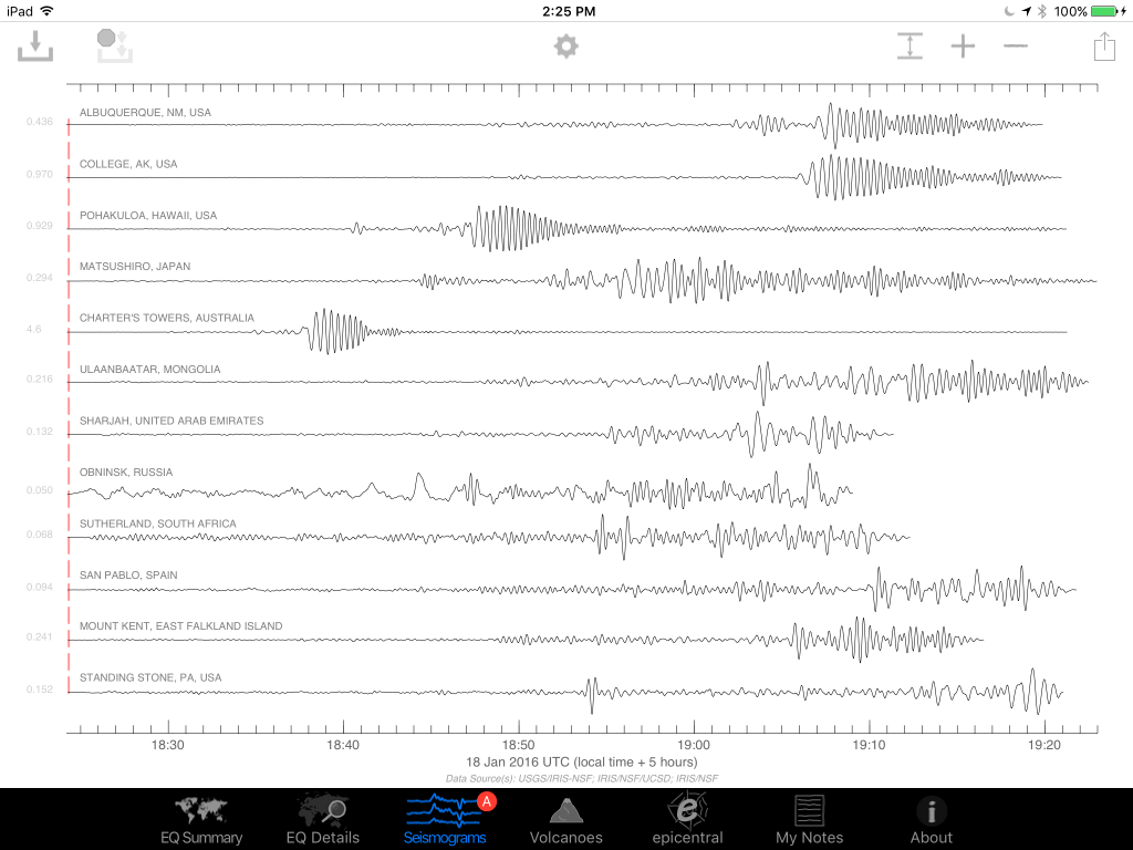
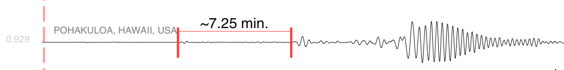
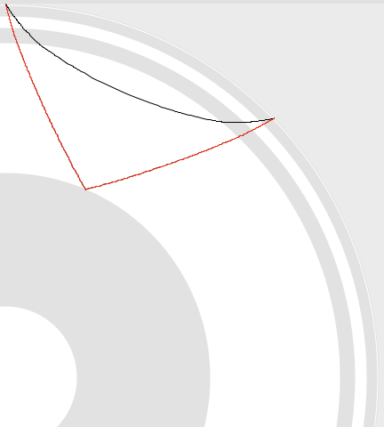
We're actually interested in the first two signals though, the classic P and S waves. Let's take a closer look at the station in Pohakuloa, Hawaii. We can see the first arrival, the P-wave, then a few minutes later the S-wave. The P-wave (a compressional, basically a sound-wave) travels faster than the transverse S-wave, so they arrive at different times. We know the wave speeds with depth in the Earth, so by using the difference in time between these arrivals, we can come up with a rough distance to the event.
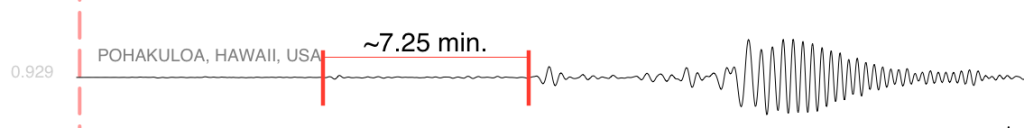
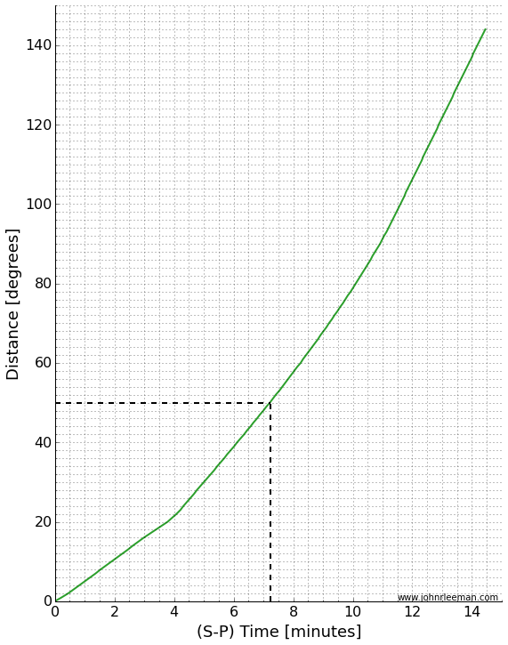
A graph of distance vs. arrival times can tell us the whole story. I've made a simple version in which you can find the time we measured (7.25 minutes) on the x-axis, then lookup the distance on the y-axis. If we do this (marked in dashed black lines), we see that the distance should be about 50 degrees.
That's not bad! I calculated the actual distance knowing the earthquake location and station location to be 49.6 degrees. The theoretical difference in travel time based on a simple Earth model is 7.14 minutes. The slight error is due to a complex real Earth, but mostly due to me picking a rough time on an iPad screen without really zooming in on the plot. The goal was to know about how far away the earthquake was from the station though, and we did that with no problem. Just from that information it was easy to tell that the event was in the Fiji region.
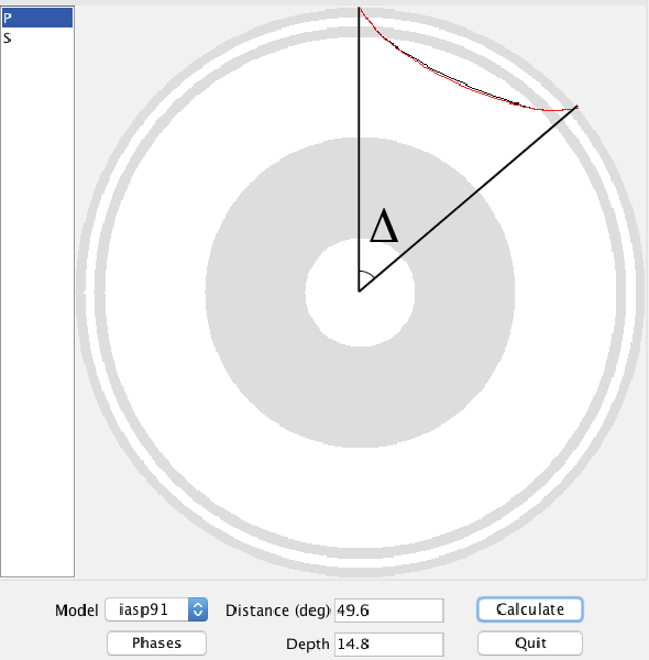
Distance is in degrees, which may seem a little strange. Since the Earth is a ball-like blob, defining distances across the surface is a little tricky when distances get large. It turns out to be more convenient to think of this distance as an angle made with the center of the earth. Take a look at the screenshot below. It's from a program called taup and shows the actual paths taken by the P and S waves through a cut-away of the Earth. I've marked the angle I'm talking about with the greek letter ∆. (We would formally say that this is the great circle arc distance in degrees. If you want to learn more about great circle arcs, you should checkout our two part podcast on map projections.)

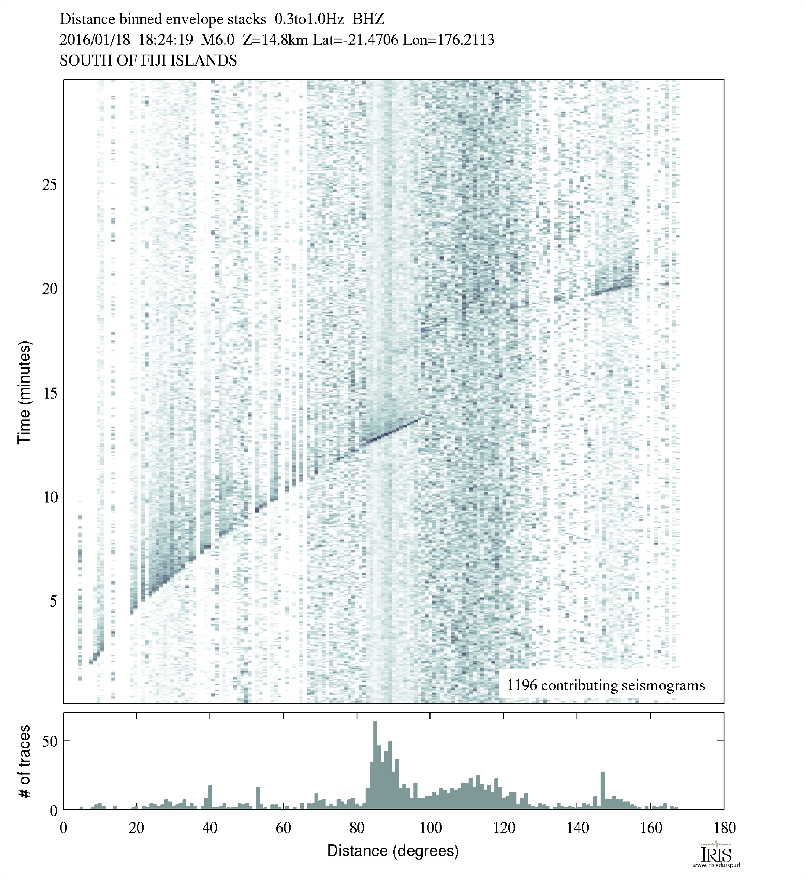
As scientists, we often look at a travel time plot a little differently. There are many different waves or "phases" that we are interested in, so plotting one line of S-P wave arrival is rather limiting. Instead we plot a classic "travel time curve" where the arrival time after the event is plotted as a function of distance. I've reproduced one below (table of data plotted from C. Ammon).
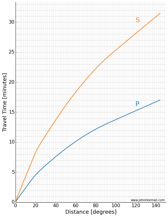
We can make a plot like this from data too! Taking many stations, plotting them as a function of distance we get a plot like the one below. You can see curved and straight lines if you stand back and squint a little. Those are arrivals of different phases across the globe! Notice the lower curved line that matches the P-wave travel time above.
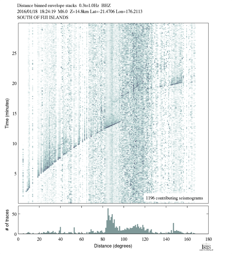
Notice the lines and curves made as different phases from the earthquake arrive across the globe. (Image: IRIS)
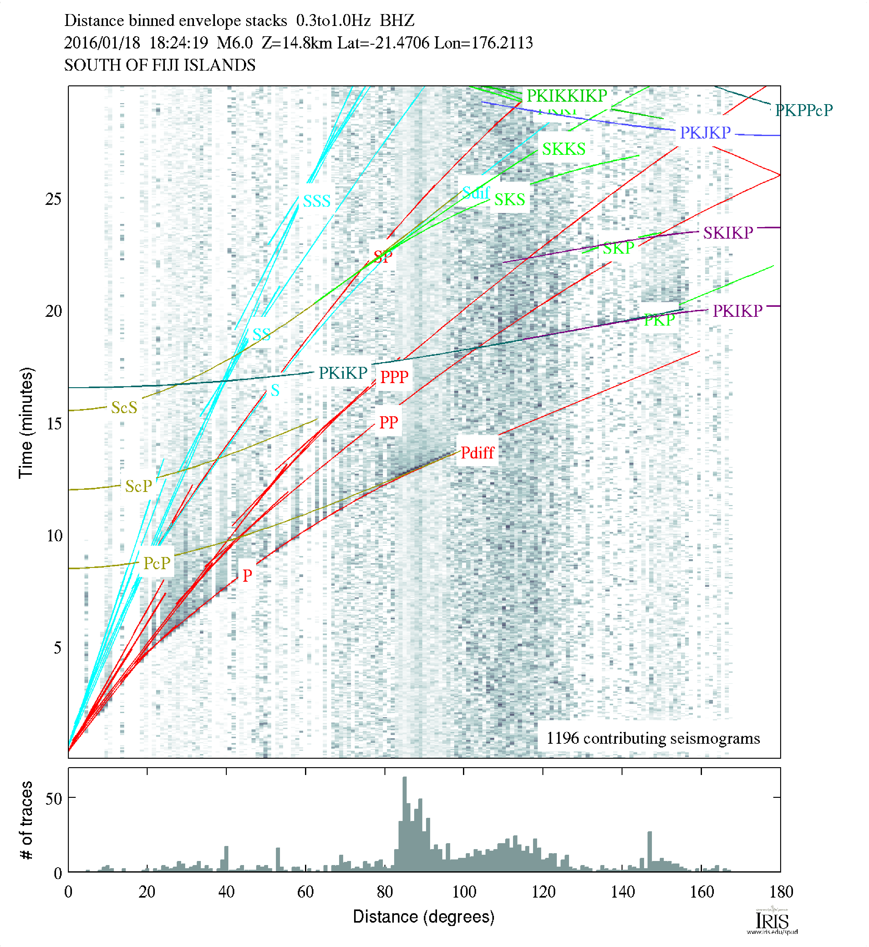
Like I mentioned, there are many different phases we can look at. To give you an idea of things a seismologist would look for, there is a version of the plot with a lot of the more complex phases marked on it below. I know it looks intimidating, but for this event, you'll see we really can't easily discern a lot of the phases. That's because this really isn't a huge event, but it's nice for us because that means the plot is easier to look at.
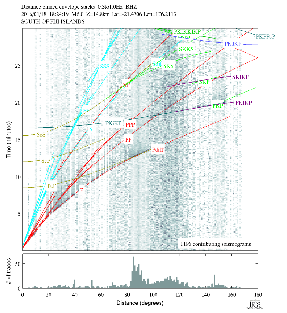
Arrival plot with phases marked. (Image: IRIS)
So there you have it, by remembering the rough travel time curves or posting one on your wall, you can quickly determine the approximate region an earthquake occurred in just by glancing at the seismograms!