Category Archives: Software

KiCad and TextExpander - How I saved a few hours of BOM making

2016-07-30 21.03.20
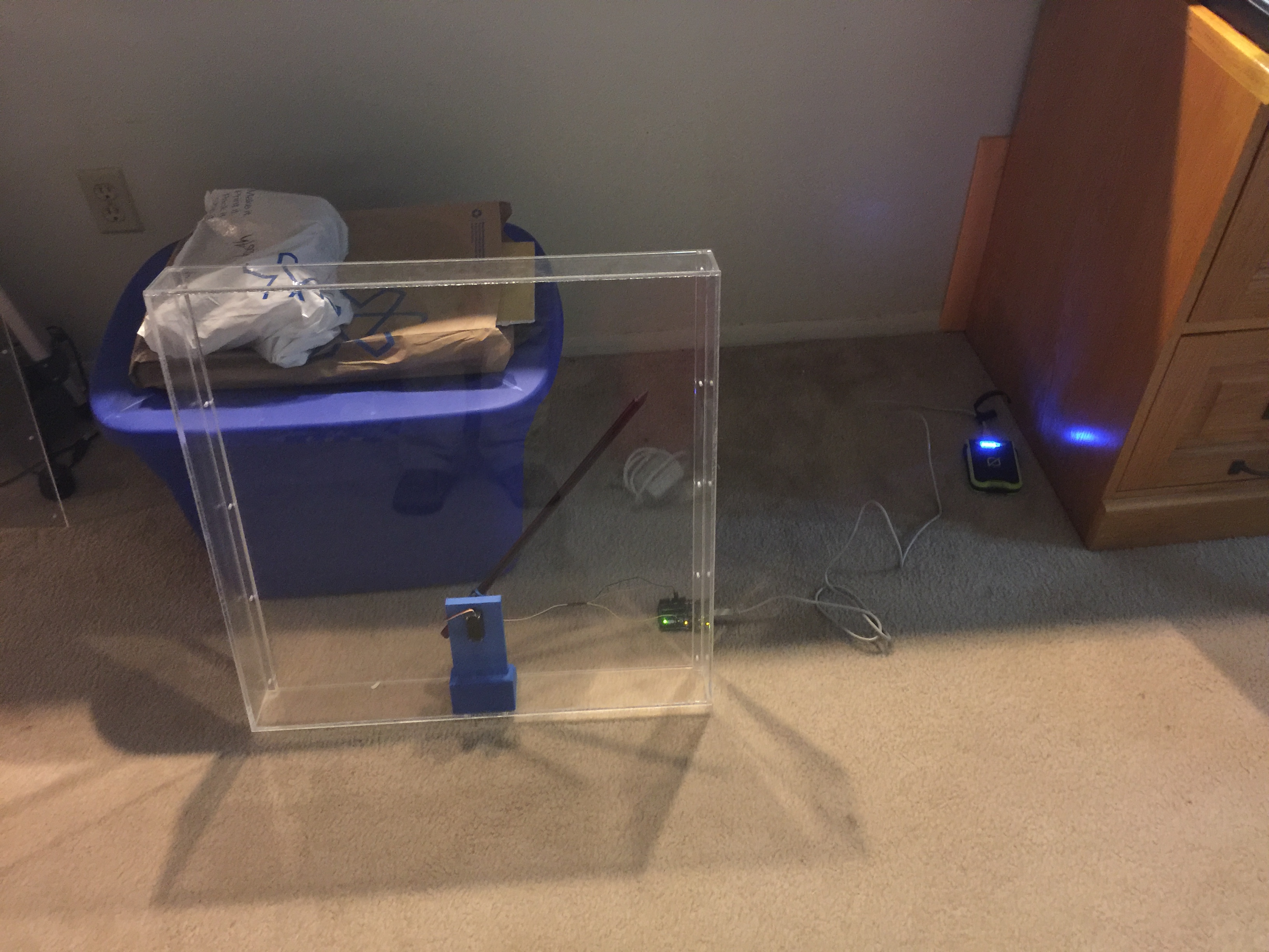
Folks that follow my various projects have probably noticed that I've recently formed an instrumentation and consulting company. I've had great fun doing several jobs for folks ranging from CAD design of brackets to writing numerical models for projects to designing custom measurement solutions. I've also been very busy designing some exciting new hardware that I hope will be available soon. In this post I wanted to share a time saving trick I used in KiCad while designing my printed circuit boards for one of these projects.

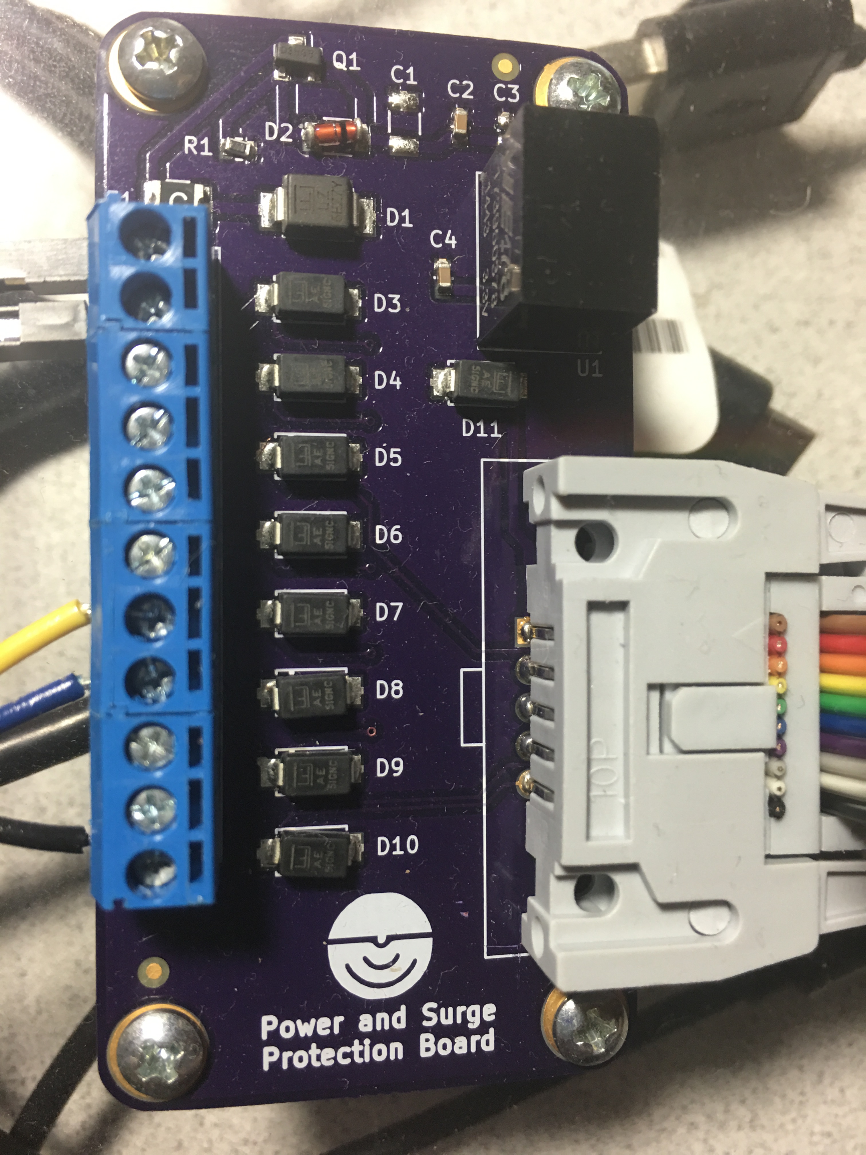
When designing things to be made in any quantity by an assembler or manufacturer (and for financial reasons) you need to keep a really good bill of materials or "BOM". Doing this often involves linked Excel sheets, binders of parts lists, and general gnashing of teeth. When working on the BOM for my circuit boards I found an excellent post by Dan over at Rheingold Heavy on designing for manufacture with KiCad. In this post he outlines a really nice workflow on how to keep track of part numbers and other meta-data  for each component. Ideally this would happen at the beginning of a project. You would assign a part (say a resistor) a manufacturer's part number, distributor's part number, etc. Then, you can copy that component (and it's metadata) as many times as you need by simply hovering over it and hitting "C". Well, I already had my entire schematic and board layout completed. I had a lot of components that were used many times (think 10 k resistors, 0.1uF caps, and jumpers). I didn't want to keep copying and pasting the information over and over from the websites of the manufactures and distributors and I didn't want to delete the components and copy in components with metadata for fear of destroying my completed project, footprint associations, and who knows what else. My solution? TextExpander.

TextExpander is a program that stores snippets of text and lets you type a few trigger keys to place all of that text in a fraction of a second. I've used it for years and it has easily saved me tens of hours on my laptop. I've got snippets for date and time stamps, outlines for our podcast, form replies about common technical issues in our lab, chunks of code that I use a lot, and really just about anything else you can imagine. (I forgot to add LaTeX equations/tables in there, but that alone saves me a lot of time on every paper I write.) The pricing model for TextExpander has changed recently, and I'm not a huge fan of the new scheme, but that's beside the point.

My idea was simple. I made a set of snippets that would expand into web addresses and part numbers. I would copy information in for a certain part, then using TextExpander add that information to add parts of that kind. After that, I'd change the snippets to the next part and repeat. Yes, this took awhile, but nowhere near as long as if I'd done all of the population by "hand". I've made a quick demo video below to show you how it's done. I hope this ends up being useful to others, let me know of any tricks you've come across to speed your DFM process.

How Thick is the Crust?

Earth's Structure (Wikipedia)

Earth's Structure (Wikipedia)

I think the first time I really heard much about the Earth's crust was on the TV show "Bill Nye the Science Guy." (In fact, I was obsessive about not missing an episode as a child and I was ecstatic when I got to see Bill speak at Penn State last year.) He talked about earthquakes and Earth's structure, cut in with funny segments of a family telling their son, "Ritchie, eat your crust."

The crust in an interesting thing - it's what we live on top of and there are lots of interesting places where it's different due to geologic processes that concentrate certain types of materials. The crust is broken up into around a dozen major tectonic plates that move at about 4-6"/year. These plates are either oceanic or continental crust. Oceanic crust is generally relatively thin ~6 km (4 miles) and oceanic crust is much thicker at ~35 km (22 miles). The thin oceanic crust is also more mafic and dense than the felsic continental crust.

These differences create complex interactions when the plates meet each other at plate boundaries. We did a whole show on plate tectonics over at the Don't Panic Geocast recently, so if you'd like to hear about the discovery and arguments over plate tectonics you should check it out.

Today, I'd like to share a tool and Dr. Charles Ammon and I have made to visualize a crust model and allow anyone to explore the crust. All you need is Google Earth! We used a model called Crust 1.0 by Laske et al. that has how thick the crust (broken up into a few divisions) is for  64,800 points on the Earth along with some other crustal properties. That's every one degree of latitude and longitude! They put a lot of work into making this model. Generally we would use a Fortran program to get values out of the model, but Dr. Ammon had an idea to visualize the data in a more intuitive way with Google Earth. Over the Thanksgiving holiday I wrote a Python utility to access the model values and then we wrote a simple script that generates a Google Earth KML file based on the model.

All you have to do is head over to the project's GitHub page and click the "Download ZIP" button. While you're waiting on the download you can scroll down and read all about the development, the model, and find activities to try. Next, open folder you downloaded (most operating systems will automatically unzip it for you now) there will be several files, but the only one you need is the CRUST_1.0.kmz file.

Screenshot 2016-03-12 07.29.51

As long as you have Google Earth installed, double click that file and you'll see the Earth appear covered in red dots. If you zoom out too far, they will disappear though!

Screenshot 2016-03-12 07.31.49

Each red dot is a location where the model has the average crustal properties like how fast P and S seismic waves can travel and the density. All of these are explained in more detail on the project webpage. You should also try some of the projects we have listed there! As a starter, let's look at oceanic and continental crust and verify my assertion about their 3x thickness difference.

Clicking out in the Atlantic Ocean (make sure you are not on the continental shelf) we see about 13 km thick crust (the top of the mantle number). The water depth is also handy to have on-hand sometimes.

Screenshot 2016-03-12 07.35.15

Clicking well onto the North American plate we see about 36 km thick crust. Next you should head over to mountainous regions and basins and see how the structure of the crust is different - why is that? Sorry, no homework answers here!

Screenshot 2016-03-12 07.35.26

This is a really fun way to learn about the crust and a good reference tool as well! There are flyers in the docs folder that you can print to use as teaching aids or handout to students! We had a lot of fun making this 1-day project and hope that you'll explore it and let us know what you think! A big thanks to the folks that did the massive amount of work making the model - we just made it visible in Google Earth! Everything is open-source as always.

Build the PiBooth - Nuts and Volts Cover Story

nv

While getting wedding arrangements ready a few months ago, my wife commented that she would like a Photo Booth at the wedding. I immediately did what I always do, write a Python script. She was thinking more of a table with props and disposable camera approach, but I decided to make it into a project that we could use on any occasion and have some fun with the Raspberry Pi.

I searched online thinking that surely somebody had already done this project and posted their code and instructions. I found a few examples of Pi based photo booth projects, but none that had code attached (mostly they said "my code is awful, so I won't share") and none that did exactly what I wanted. I wanted the booth to count down, take multiple photos of the guests, and store/tweet the photos. I also wanted it to be simple to plug in and turn on with no experience required - same for shutdown.

After a few afternoon coding sessions, I had the basic code and guts of the project working. A little time with some wood tools and I had a pretty decent looking enclosure setup as well!

An initial prototype circuit to test the code for the PiBooth.

An initial prototype circuit to test the code for the PiBooth.

Rough cutting the hole for the photo booth screen in the shop.

Rough cutting the hole for the photo booth screen in the shop.

I wanted to make sure that everything I did was out in the open to be reproduced. I ended up deciding to try writing a magazine article about the build for the electronics hobbyist magazine "Nuts and Volts." The editor sent me some guidelines and after a few hours I had a draft article.  A couple of months passed by while we iterated on figures and ideas, but I was very excited when I was contacted saying that this article was being considered for the cover of the March 2016 issue. As you can see - it was selected! Be sure to grab a copy of Nuts and Volts (check your bookseller/news-stand) and read all of the details. You can grab the code over on the GitHub repository. Thank you to all the wonderful folks at the magazine for making this happen and thank you to my wife for letting me run wild with this project! Let me know if you build one, or a variant. The applications can range from parties/events to making an automated I.D. card station for your company!

Figure 1

Guts of the project.

Guts of the project.

Squeezing Rocks with your Bare Hands

Our lab group. Photo: Chris Marone

Our lab demo group. Photo: Chris Marone

As frequent readers of the blog or listeners of the podcast will know, I really like doing outreach activities. It's one thing to do meaningful science, but another entirely to be able to share that science with the people that paid for it (taxpayers generally) and show them why what we do matters. Outreach is also a great way to get young people interested in STEAM (Science, Technology, Engineering, Art, Math). When anyone you are talking to, adult or child, gets a concept that they never understood before, the lightbulb going on is obvious and very rewarding.

Our lab group recently participated in two outreach events. I've shared about the demonstrations we commonly use before when talking about a local science fair. There are a few that probably deserve their own videos or posts, but I wanted to share one in particular that I improved upon greatly this year: Squeezing Rocks.

Awhile back I shared a video that explained how rocks are like springs. The normal demonstration we used was a granite block with strain gauges on it and a strip chart recorder... yes... with paper and pen. I thought showing lab visitors such an old piece of technology was a bit ironic after they had just heard about our lab being one of the most advanced in the world. Indeed when I started the paper feed, a few parents would chuckle at recognizing the equipment from decades ago. For the video I made an on-screen chart recorder with an Arduino. That was better, but I felt there had to be a better way yet. Young children didn't really understand graphs or time series yet. Other than making the line wiggle, they didn't really get the idea that it represented the rock deforming as they stepped on it or squeezed it.

I decided to go semi old-school with a giant analog meter to show how much the rock was deformed. I wanted to avoid a lot of analog electronics as they always get finicky to setup, so I elected to go with the solution on a chip route with a micro-controller and the HX711 load cell amplifier/digitizer. For the giant meter, I didn't think building an actual meter movement was very practical, but a servo and plexiglass setup should work.

A very early test of the meters shows it's 3D printed servo holder inside and the electronics trailing behind.

A very early test of the meters shows it's 3D printed servo holder inside and the electronics trailing behind.

Another thing I wanted to change was the rock we use for the demo. The large granite bar you stepped on was bulky and hard to transport. I also though squeezing with your hands would add to the effect. We had a small cube of granite about 2" on a side cut with a  water jet, then ground smooth. The machine shop milled out a 1/4" deep recess where I could epoxy the strain gauges.

Placing strain gauges under a magnifier with tweezers and epoxy.

Placing strain gauges under a magnifier with tweezers and epoxy.

Going into step-by-step build instructions is something I'm working on over at the project's Hack-a-Day page. I'm also getting the code and drawings together in a GitHub repository (slowly since it is job application time). Currently the instructions are lacking somewhat, but stay tuned. Checkout the video of the final product working below:

The demo was a great success. We debuted it at the AGU Exploration Station event. Penn State even wrote up a nice little article about our group. Parents and kids were amazed that they could deform the rock, and even more amazed when I told them that full scale on the meter was about 0.5µm of deformation. In other words they had compressed the rock about 1/40 the width of a single human hair.

A few lessons came out of this. Shipping an acrylic box is a bad idea. The meter was cracked on the side in return shipping. The damage is reparable, but I'm going to build a smaller (~12-18") unit with a wood frame and back and acrylic for the front panel. I also had a problem with parts breaking off the PCB in shipment. I wanted the electronics exposed for people to see, but maybe a clear case is best instead of open. I may try open one more time with a better case on it for transport. The final lesson was just how hard on equipment young kids can be. We had some enthusiastic rock squeezers, and by the end of the day the insulation on the wires to the rock was starting to crack. I'm still not sure what the best way to deal with this is, but I'm going to try a jacketed cable for starters.

Keep an eye on the project page for updates and if any big changes are made, you'll see them here on the blog as well. I'm still thinking of ways to improve this demo and a few others, but this was a giant step forward. Kids seeing a big "Rock Squeeze O Meter" was a real attention getter.

Hmm... As I'm writing this I'm thinking about a giant LED bar graph. It's easy to transport and kind of like those test your strength games at the fair... I think I better go parts shopping.

Using Visual Mics in Geoscience

Image: TED Talk

Image: TED Talk

Last time I wrote up the basics of a tip sent in by Evan over at Agile Geoscience. This technology is very neat, if you haven't read that post first, please do and watch the TED talk. This post is going to be about how we could apply this to problems in geoscience. Some of these ideas are "low hanging fruit" that could be relatively easy to accomplish, others are in need of a few more PhD students to flesh them out. I'd love to work on it myself, but I keep hearing about this thing called graduation and think it sounds like a grand time. Maybe after graduation I can play with some of these in detail, maybe before I can just experiment around a bit.

In his email to me, Evan pointed out that this visual microphone work IS seismology of sorts. In seismology we look at the motion of the Earth with seismometers or geophones. If we have a lot of them and can look at the motion of the Earth in a lot of places over time, we can learn a lot about what it's like inside the Earth. This type of survey has been used to understand problems as big as the structure of the Earth and as small as finding artifacts or oil in shallow deposits. In (very) general terms we look at very low frequency waves for Earth structure problems with periods of a second to a few hundred seconds. For more near surface problems we may look at signals up to a few hundred cycles per second (Hz). Remember in the last post I said that we collect audio data at around 44,200 Hz? That's because as humans we are able to hear up to around 20,000 Hz. All of this is a lot higher frequency than we ever use in geoscience... I'm thinking that makes this technique somewhat easier to apply and maybe even able to use poor quality images.

So what could it be used for? Below are a few bullet points  of ideas. Please add to them in the comments or tear them apart. I agree with Evan that there is some great potential here.

  • Find/visualize/simulate stress and strain concentration in heterogeneous materials.
  • Extract modulus of rock from video of compression tests. Could be as simple as stepping on the rock.
  • Extend the model to add predicted failure and show expected strain right before failure.
  • Look at a sample from multiple camera views and combine for the full anisotropic properties. This smells of some modification of structure from motion techniques.
  • Characterize complicated machines stiffness/strain to correct for it when reducing experimental data without complex models for the machine.
  • Try prediction of building response during shaking.
  • What about perturbing bodies of water and modeling the wave-field?

With everything in science, engineering, and life, there are tradeoffs. What are the catches here? Well, the resolution is pretty good, but may not be good enough for the small differences in properties we sometimes deal with. In translating this over to work on seismic data I think a lot of algorithm changes would have to happen that may end up making it about the same utility as our first-principles approaches. A big limitation for earthquake science is what happens at large strains. The model looks at small strains/vibrations to model linear elastic behavior. That's like stretching a spring and letting it spring back (remember Hooke's Law?). Things get interesting in the non-linear part of deformation when we permanently deform things. Imagine that you stretch the spring above much further than it was designed to be. The nice linear-elastic behavior would go away and plastic deformation would start. You'd deform the spring and it wouldn't ever spring back the same way it was again. Eventually, as you keep stretching, the spring would break. The non-linear parts of deformation are really important to us in earthquake science for obvious reasons. For active seismic survey people, the small strain approximation isn't bad though.

Another issue I can imagine is combining video from different orientations to recover the full behavior of the material. I don't know all of the details of Abe's algorithm, but I think it would have problems with anisotropic materials. Those are materials that behave differently in different directions. Imagine a cube that can be easily squeezed on two opposing faces, but not easily squeezed on the others. Some rocks behave in such a way (layered rocks in particular). That's really important since they are also common rocks for hydrocarbon operations to target! Surrounding the sample area with different views (video or seismic) and using all of that information should do the job, but it's bound to be pretty tricky.

The last thing that strikes me is processing time. I don't think I've seen any quotes of how long the processing of the video clips took to recover the audio. While I don't think it's ludicrous, I think the short clips could conceivably take a few hours per every 10 seconds (this is a guess). For large or long duration geo experiments that could become an issue.

So what's the end story? Well, I think this is a technology that we haven't seen the last of. The techniques are only going to get better and processors faster to let us do more number crunching. I'm curious to watch this develop and try to apply it in some basic experiments and see what happens. What would you try this technique on? Leave it in the comments!

Sensors, Sensors Everywhere!

This year at the fall meeting of the American Geophysical Union, I presented an education abstract in addition to my normal science content. In this talk, I wanted to raise the awareness of how easy it is to work with electronics and collect geoscience relevant data. This post is here to provide anyone that was at the talk, or anyone interested, with the content, links, and resources!

Sensors and microcontrollers and coming down in price thanks to mass production and advances in process technology. This means that it is now incredibly cheap to collect both education and research grade data. Combine this with the emergence of the "Internet of Things" (IoT), and it makes an ideal setup for educators and scientists. To demonstrate this, we setup a small three-axis magnetometer to measure the Earth's magnetic field and connected it to the internet through data.sparkfun.com. I really think that involving students in the data collection process is important. Not only do they realize that instruments aren't black boxes, that errors are real, and that data is messy, but they become attached to the data. When a student collects the data themselves, they are much more likely to explore and be involved with it than if the instructor hands them a "pre-built" data set.

For more information, watch the 5-minute talk (screencast below) and checkout the links is the resources section. As always, email, comments, etc are welcome and encouraged!

Resources

Talk Relevant Links

- Slides from the talk
- This blog! I post lots of electronics/data/science projects throughout the year.
- Raspberry Pi In The Sky
- Kicksat Project
- Weather Underground PWS Network
- uRADMonitor
- Our IoT magnetometer data stream
- Python Notebooks
- GitHub repository for the 3D Compass demo
- AGU Pop-Up Session Blog

Parts Suppliers

- Adafruit
- Sparkfun
- Digikey
- Element14

Assorted Microcontrollers/Computers

- Beagle Bone
- Raspberry Pi
- Arduino
- Propeller
- MBed
- Edison
- MSP430
- Light Blue Bean

General

- Thingiverse 3D printing repository
- Maker blogs from places like Hackaday, MAKE, Adafruit, Sparkfun, etc

How I Design a Talk

This year I'm co-chairing a session at the American Geophysical Union meeting called "Teaching and Career Challenges in Geoscience." We have been maintaining a blog for the session at keepinggeologyalive.blogspot.com. I wrote a post that I wanted to cross-post here in hopes that you too may find a few tips to help with the next presentation you need to give.

Hello everyone! While I was preparing my talk, I thought I would share my process in the hope that maybe someone will find a useful nugget or two. There are lots of great resources out there. Books like Pitch PerfectTalk Like TED, and the MacSparky Presentations Field Guide are great places to start. With AGU only a couple of weeks away, I wanted to highlight a few ideas on presentation planning.First, close PowerPoint or Keynote. The presentation software is not the place to start preparing a presentation. I like to sit down in a comfortable spot with a stack of index cards and a mug of coffee. While I love technology as a tool, it's just too early. I write out one major thought on the top of each card and put supporting material on as a list. For a short talk, like the pop-ups, this is just a few cards, but I've had stacks over 2 cm high for longer talks. I put everything I might want to bring up on these, pruning the content comes later.  After my cards are made, I lay them out on a big table (or the floor) and play with the ordering. I'll ad-lib sections of a fake talk and see if two thoughts can flow smoothly into each other. Once I'm happy with the general layout, then I'm ready to move on.

After playing with index cards, I'll let technology in. I like using OmniOutliner to help here. I put my index cards into a digital outline. Lots of people start here, which is fine. I like starting on paper because I can sketch things out and feel less constrained. Index cards also don't have email notifications that interrupt your thinking. In OmniOutliner, I break out my thoughts into short bullets. I can drag in content such as a photo of a sketch I think may turn into a graphic, sound bytes of an idea, or quotes I want to include.

Now it is time to decide on supporting graphics. I have an idea of what I'm going to say, so what visual aides will help tell the story? Your slides are not an outline and are not meant to guide you through the content. You and the slides together will guide an audience through your work in a logical way. Graphics can be photos, graphs of data, schematic diagrams, anything! Personally, I like make my graphics using an assortment of applications like PythonAdobe Illustrator, or OmniGraffle. Making graphics is a whole other series of books that you could dive into, including the great books by Nathan Yau: Visualize This and Data Points.

Finally, it's time to make your slides. I follow the Michael Alley approach of a slide with a (nearly) complete sentence at the top, followed by graphics. The fewer things that the audience has to read, the closer they will be listening to what you have to say. If you need to document your material to hand-out, produce a small one or two page text document with the necessary graphics (an idea from Edward Tufte). Again, the slides should not be the presentation, but support for it.  If you are stuck for ideas on slide design, head over to Garr Reynold's blog Presentation Zen. Garr has some great examples, as well as his own books.

My last tip regards the ends of your presentation. The beginning and the ending are incredibly important. The beginning is where you gain or loose the audience, and the end is where you make sure that their time was well spent. Nail these. I don't script presentations, it sounds too robotic, but the first and last 30 seconds are written down and well thought out.

I can't wait to hear what everyone has to share and I hope that some of these tips and resources are useful in your preparation!

Exploring Scientific Computing at SciPy 2014

Texas Campus

This past week I've been in Austin, TX attending SciPy 2014, the scientific Python conference.  I came in 2010 for the first time, but hadn't been able to make it back again until this year.  I love this conference because it gives me the chance to step away from work on my PhD and distractions of hobby projections to focus on keeping up with the world of scientific computing with Python.  I try to walk the fine line between being a researcher, engineer, and programmer everyday.  That means that it is easy to fall behind the state of the art in any one of those, and conferences like this are my way to getting a chance to learn from the best.

SciPy consists of tutorials, the conference, and sprints:

The first two days were tutorials in which I got to learn about using interactive widgets in iPython notebooks, reproducible science, image processing, and Bayesian analysis.  I see lots of things that I can apply in my research and teaching workflows!  Interactive notebooks are one of the last things that I was wishing for from the Mathematica notebooks.

The next three days were talks in which we got to see the newest software developments and creative applications of Python to scientific problems.  I, of course, gravitated to the geophysics oriented talks and even ran into some people with common connections.  It was during the conference that I gave my poster presentation.  I knew that the poster focused more on the application of Python to earthquake science than any earth-shaking (pun-intended) software development.  There were a few on the software side that wondered why I was there (as expected), but the poster was generally very well received.  Again I had several chance encounters with people from Google and other companies that had similar backgrounds or were just very interested in earthquakes!

The final two days (I'm writing this on the last day) were sprints.  These are large pushes to further develop the software while a critical mass of experts are in one location.  I'm still new enough to these massive open-source projections (on the development side at least) that I wasn't incredibly useful, but the reception of the developers was great!  Everyone was excited if you wanted to help and would spend as much time as needed to get you up and running.  During the sprints I've been following a fix for an issue that has recently caused problems in my plotting.  I also fixed a tiny issue (with help) and had my first pull request accepted.  For software people these are tiny steps, but for someone coming from just developing in-house purpose-designed tools.... it was an hit of the open-source collaboration drug.

Lastly, I worked on a project of my own during the evenings.  During the 2010 conference I worked with a friend to make a filter remove the annoying vuvuzela sound from the World Cup audio.  This year I've been making a fun earthquake visualization tool.  You'll be seeing it here on the blog, and may have already seen it if you follow me on twitter.  I learned a lot during this year's SciPy 2014, got to spend time with other alums of OU Meteorology, and meet some new folks.  Next on the blog we'll be back to some radar or maybe a quick earthquake discussion!

Never Confuse Chip Pinouts Again!

chip_labels


UPDATE: John Meacham commented below letting us know that he has updated the package.  It can now be installed with it's new features by installing the packages I mention below and then:

>>  sudo apt-get install libfile-slurp-perl
>> apt-get install darcs
>> darcs get http://repetae.net/repos/clabel

This is a topic of interest to a rather limited group, but one well worth posting I believe.  Those who build electronic circuits regularly know the pain of constantly swapping back and forth between datasheets when trying to remember which pin of an integrated circuit does what.  It's different for almost every chip and can slow down prototyping when you're on the fly or don't have internet access.  John Meacham over at Not A Number  decided to remedy this problem after noticing that 6mm tape from a Brother label printer fit perfectly on top of his chips!

You can find his Perl script over here, but I wanted to elaborate on how to get it working and my experience with it thus far.  I ended up running the code on an Ubuntu virtual machine with Parallels.  I had lots of problems getting the libraries needed to run on Mac OSX, but the Linux install took just a few minutes.

First, download and unzip the files from John's website.  There is a read-me telling you how to run the scripts, but we don't get there just yet.  First we must install the GD module for pearl and the cups-bsd for printing utilities.  To do so, follow these two commands:

>>  sudo apt-get install libgd-gd2-perl
>>  sudo apt-get install cups-bsd

Since we're going to make our own custom labels as well, we'll need two more packages.  The barcode and YAML packs.  Just run:

>>  sudo apt-get install libconfig-yaml-perl
>>  sudo apt-get install libgd-barcode-perl

Okay, now we need to install our printer.  Just plug in your Brother printer and follow the normal steps to install it just like any other device.  Ubuntu automatically found the drivers for me and set it up.

Next I just printed out a 555 timer IC label to get started.  My printer is called labelprinter, so the command was:

>>./print_png.prl -Plabelprinter -w 6 out/555.png

The label printed out! Now I did notice that sometimes there is some garbage at the beginning of the label, but I trimmed that off with scissors anyway.  I do wish there was a way to prevent the printer from feeding and cutting after every label though, it wastes some label tape.  There may be a way to modify the scripts.

While there are a few included labels, you'll want to make your own eventually.  This is done with YAML.  Let's make a label for the 74LVC244A octal buffer/driver.  First we'll look at the datasheet (here) and get the pinout.  Below is the screen-shot of the datasheet spec.

pinout

We must write a YAML file to describe this pinout:

74hc165:
name: 74hc165 - PISO register
pins:
- /PL
- CP
- D4
- D5
- D6
- D7
- /Q7
- GND
- Q7
- DS
- D0
- D1
- D2
- D3
- /CE
- Vcc

The / before the pin will add the overbar to indicate the active state of the pin.  The YAML code is added to the file chips.yaml and we run the script:

>>   ./chip_label.prl -c 74LVC244A

We now have a new label to print and affix to our chips! 74lvc244a

There we go! Sorry this was a bit lengthy and technical, but this tool is incredibly useful for anyone involved with prototyping!

Laser Cave Profiling - The Beginning

Inspired by caving friend Nathan Williams photos of this technique I decided to try to duplicate his results and then write some great software.  The idea is to make profiles of cave tunnels known as cross sections very easily and accurately.  Cross sections are commonly sketched by a cave mapper by eye with a very rough scale.  Sometimes the passage is measured in height and width with a tape.

Here we use a motorized laser level and a DSLR camera to try to construct profiles.  After seeing Nathan's photos I got the laser level from Harbor Freight Tools (~$60) and used my Nikon D40X in a local Arkansas cave.

Today I just did a quick test about 100 ft. into the passage.  Below is a picture looking toward the level with flash so the tunnel profile can be seen.  Then I did a 20 second exposure with the level running and all lights off.  There was a small amount of light from the entrance, but negligible.

I then read the image into python, remove tripod reflections by subtracting the average of the blue and green channels from the red and then inverting the resulting monochrome image.  The result is seen below:

The big thing I need is the software to then produce a set of points that describe the profile so I can implement routines to compute area and make a pseudo 3-D model of the cave by stacking many closely spaced profiles.  I also tested the scale of the image by counting how many pixels wide the level appears and then determined the pixels/cm count to get the size of the tunnel.  This process will be improved and automated as the software develops.

I'm open to suggestions from cavers and numerical methods folks.  I have a contouring algorithm (Moore-Neighbor Tracing) coded, but it doesn't handle the breaks in the profile.  Any ideas on making it continuous and possibly minor smoothing? I plan to build a "T" shape device with 4 dim LEDs to provide a larger scale target.