Category Archives: Public Speaking

Sensors, Sensors Everywhere!

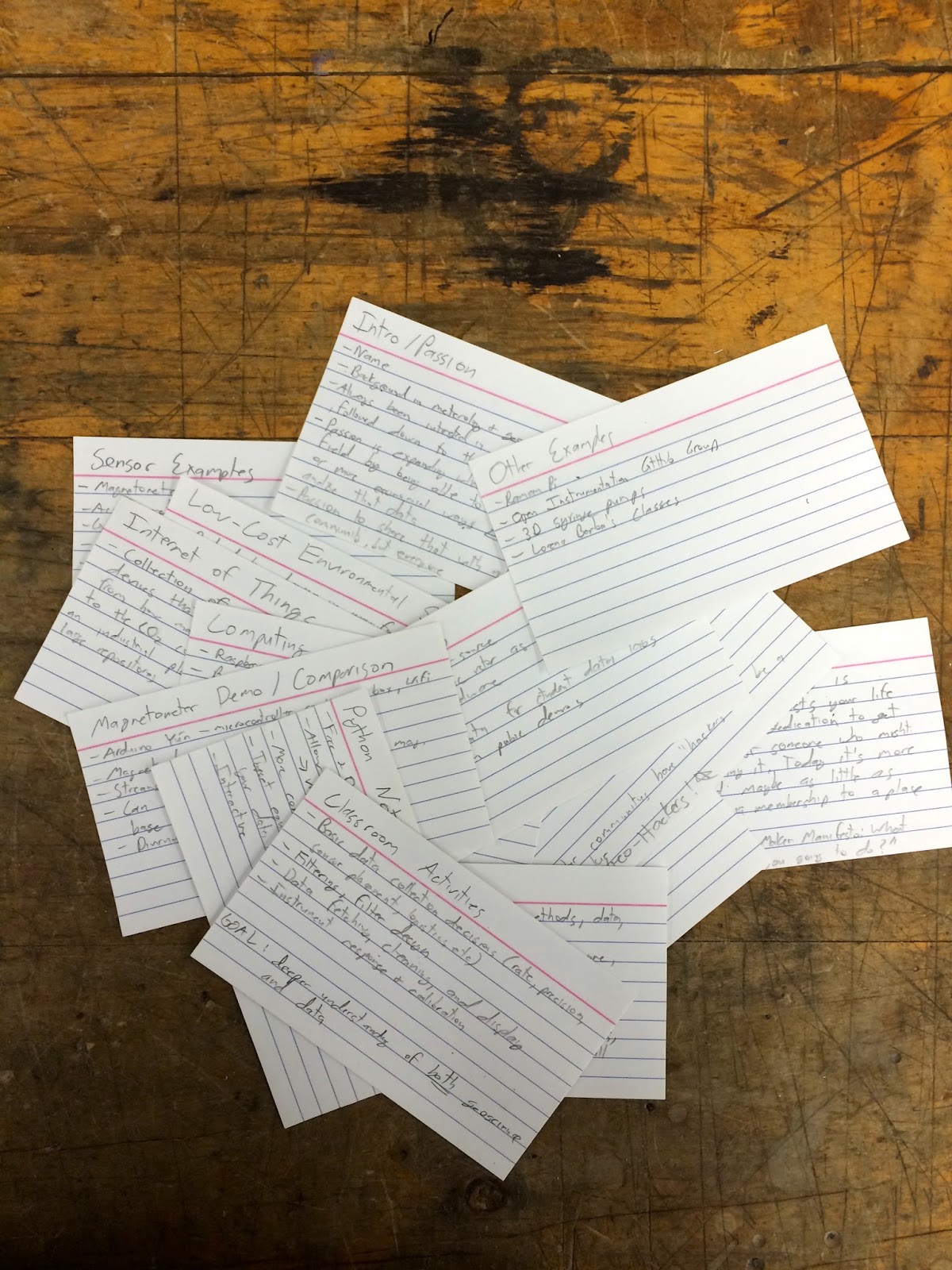
This year at the fall meeting of the American Geophysical Union, I presented an education abstract in addition to my normal science content. In this talk, I wanted to raise the awareness of how easy it is to work with electronics and collect geoscience relevant data. This post is here to provide anyone that was at the talk, or anyone interested, with the content, links, and resources!

Sensors and microcontrollers and coming down in price thanks to mass production and advances in process technology. This means that it is now incredibly cheap to collect both education and research grade data. Combine this with the emergence of the "Internet of Things" (IoT), and it makes an ideal setup for educators and scientists. To demonstrate this, we setup a small three-axis magnetometer to measure the Earth's magnetic field and connected it to the internet through data.sparkfun.com. I really think that involving students in the data collection process is important. Not only do they realize that instruments aren't black boxes, that errors are real, and that data is messy, but they become attached to the data. When a student collects the data themselves, they are much more likely to explore and be involved with it than if the instructor hands them a "pre-built" data set.

For more information, watch the 5-minute talk (screencast below) and checkout the links is the resources section. As always, email, comments, etc are welcome and encouraged!

Resources

Talk Relevant Links

- Slides from the talk
- This blog! I post lots of electronics/data/science projects throughout the year.
- Raspberry Pi In The Sky
- Kicksat Project
- Weather Underground PWS Network
- uRADMonitor
- Our IoT magnetometer data stream
- Python Notebooks
- GitHub repository for the 3D Compass demo
- AGU Pop-Up Session Blog

Parts Suppliers

- Adafruit
- Sparkfun
- Digikey
- Element14

Assorted Microcontrollers/Computers

- Beagle Bone
- Raspberry Pi
- Arduino
- Propeller
- MBed
- Edison
- MSP430
- Light Blue Bean

General

- Thingiverse 3D printing repository
- Maker blogs from places like Hackaday, MAKE, Adafruit, Sparkfun, etc

How I Design a Talk

This year I'm co-chairing a session at the American Geophysical Union meeting called "Teaching and Career Challenges in Geoscience." We have been maintaining a blog for the session at keepinggeologyalive.blogspot.com. I wrote a post that I wanted to cross-post here in hopes that you too may find a few tips to help with the next presentation you need to give.

Hello everyone! While I was preparing my talk, I thought I would share my process in the hope that maybe someone will find a useful nugget or two. There are lots of great resources out there. Books like Pitch PerfectTalk Like TED, and the MacSparky Presentations Field Guide are great places to start. With AGU only a couple of weeks away, I wanted to highlight a few ideas on presentation planning.First, close PowerPoint or Keynote. The presentation software is not the place to start preparing a presentation. I like to sit down in a comfortable spot with a stack of index cards and a mug of coffee. While I love technology as a tool, it's just too early. I write out one major thought on the top of each card and put supporting material on as a list. For a short talk, like the pop-ups, this is just a few cards, but I've had stacks over 2 cm high for longer talks. I put everything I might want to bring up on these, pruning the content comes later.  After my cards are made, I lay them out on a big table (or the floor) and play with the ordering. I'll ad-lib sections of a fake talk and see if two thoughts can flow smoothly into each other. Once I'm happy with the general layout, then I'm ready to move on.

After playing with index cards, I'll let technology in. I like using OmniOutliner to help here. I put my index cards into a digital outline. Lots of people start here, which is fine. I like starting on paper because I can sketch things out and feel less constrained. Index cards also don't have email notifications that interrupt your thinking. In OmniOutliner, I break out my thoughts into short bullets. I can drag in content such as a photo of a sketch I think may turn into a graphic, sound bytes of an idea, or quotes I want to include.

Now it is time to decide on supporting graphics. I have an idea of what I'm going to say, so what visual aides will help tell the story? Your slides are not an outline and are not meant to guide you through the content. You and the slides together will guide an audience through your work in a logical way. Graphics can be photos, graphs of data, schematic diagrams, anything! Personally, I like make my graphics using an assortment of applications like PythonAdobe Illustrator, or OmniGraffle. Making graphics is a whole other series of books that you could dive into, including the great books by Nathan Yau: Visualize This and Data Points.

Finally, it's time to make your slides. I follow the Michael Alley approach of a slide with a (nearly) complete sentence at the top, followed by graphics. The fewer things that the audience has to read, the closer they will be listening to what you have to say. If you need to document your material to hand-out, produce a small one or two page text document with the necessary graphics (an idea from Edward Tufte). Again, the slides should not be the presentation, but support for it.  If you are stuck for ideas on slide design, head over to Garr Reynold's blog Presentation Zen. Garr has some great examples, as well as his own books.

My last tip regards the ends of your presentation. The beginning and the ending are incredibly important. The beginning is where you gain or loose the audience, and the end is where you make sure that their time was well spent. Nail these. I don't script presentations, it sounds too robotic, but the first and last 30 seconds are written down and well thought out.

I can't wait to hear what everyone has to share and I hope that some of these tips and resources are useful in your preparation!

Communicating Science: The Lost Art of the "Chalk Talk"

During this semester our lab group has been holding a weekly seminar in which everyone gets together to hear about the latest and greatest that other members of the group are doing.  In a group with multiple professors and many students it is easy to lose track of what is happening in the lab on a daily basis!  When organizing the meetings it was suggested that the presenter of each ~40-50 minute talk use only the chalk boards, no slides, no handouts.  While there was much grumbling from the group, I was rather excited at the idea of giving such a "naked" talk, and it turns of so was one of the great physicists: John Wheeler. Wheeler was famous for going into the lecture hall before his talk and covering the chalk-boards with very nice color diagrams, then walking through them.  Here I am going to discuss my attempt and giving a John Wheeler style talk, and why you should as well.

John Wheeler giving one of his famous talks with colorful hand-drawn illustrations.

For my talk, I was going to be discussing electrical phenomena surrounding earthquakes such as radio emissions and earthquake lights.  After some background I wanted to discuss some laboratory experiments I've done and propose a model to explain the data.  A few challenges were immediately apparent:

1) I can't show exact data plots or scatter plots with many hundreds of data-points.
2) Showing photographs isn't an option.
3) There is no room for all the content that would have been in a slide presentation.
Having just attended a workshop by Michael Alley on "The Craft of Scientific Presentation," many of these "challenges" resonated with things that presenters do, but shouldn't.  We often overload our audience with information: many words on a slide, complex plots, and us speaking fast to beat the buzzer.  We also depend on our slides to guide our talk instead of having the "story" and path well developed in our heads and just using the slides as visual aids.  Dr.Alley even mentioned that one of his favorite slides is the plain black slide, because then the focus is on the presenter and their words.  
In preparing the chalk-talk I thought about how to tell my story, wrote that down, then decided what visual aids would be helpful.  I drew a sketch of those aids by the notes I had just made and then began cutting many of them.  The drawings on my paper would have taken the chalkboards in the room times two! I didn't want to erase anything and draw in real-time for two reasons: it wasted time that we could be talking about science and it didn't let me draw intricate diagrams.  In the end I drew the final set of diagrams on a separate piece of paper and only had one word list in the introduction to help make a point about the diversity of natural observations.
The morning of the talk I went to the room about an hour before people would be arriving with two boxes of chalk (one plain white and one of many colors).  I spent the hour drawing the figures, erasing, drawing again, refining, removing, etc.  Drawing some data plots was difficult, but let me get away from the audience worrying about noise and other artifacts.  By being able to emphasize the important points in the data it made the plots less confusing for the audience.

The entire talk.  I walked around the boards and presented for about 50 minutes.

During the talk I just walked down the boards and talked through the points I had outlined without bulleted lists.  Doing so I noticed a few things:

- The audience eye-contact was just incredible.  Instead of looking at my slides and reading words, examining detailed plots, or other distractions there was a lot of focus on the topic matter.
- The style of the presentation was very relaxed and let me steer the talk dynamically.  Unlike slides that fix you into a path from the moment you click "Show Presentation," I could adjust the level on-the-fly as the audience showed interest or got lost.
- Making the diagrams made me notice things in my data when looking for ways to simplify it.
- Preparing for this talk I learned where gaps in my knowledge were because I refused to rely on pulling figures directly from a paper as we often do in making slides.

My attempt at summarizing about 20 minutes of talking points in diagrams alone.

Overall the talk was very well received and I got some great feedback on the research.  The biggest drawback was also one of the advantages: plots.  Though my simplified drawings made understanding easier for the audience, my drawing skills also caused some questions that were on "artifacts" in my art skills, not the data.  When drawing a time series, making sure things were precisely lined up was a bit tricky, but showing a real plot would probably introduce more confusion due to the complication.

Next time you have to give a talk to a small group in a classroom you should try a chalk-talk! They are simple and I think you'll be pleasantly surprised at both your own understanding and the reaction and engagement of the audience.  If you do, let me know how it goes!