Today we're going to follow up on the last blog post about the explosion of a meteorite over Chelyabinsk, Russia. The process of figuring out precise infrasound arrival times is quite a tricky process, the travel times depend on winds, humidity, and many other atmospheric variables that are hard to constrain over such a long travel path. I've had several fantastic discussions with Dr. Charles Ammon here at Penn State to try to obtain the infrasound data that was collected near the blast, but so far we have not been able to get it. When/if we do, expect another posting.
The focus of this post will actually be the seismic data near the blast. There are many seismometers all over the Earth that record the motion of the ground many times a second. After some discussion of the infrasound and seismic data available with Dr. Ammon, we found some really nice, simple results that would make a great laboratory assignment for an introductory seismology or geoscience class. The activity could range from reading times of arrivals on provided graphs for a non-majors class, to filtering and grid searching to estimate the precise detonation location for a more advanced class. I've provided the data and some thoughts on it below.
We'll consider data from five seismic observatories, the station names are ARU, BRVK, KURK, OBN, and ABKAR. Below is a map showing the station location, distance to the blast (red star), and a seismogram from that station. The seismogram shows how the ground is moving through time, in this case I'm showing the "Z" component. This really just means we're looking at how the ground is moving up and down, though these stations also record North/South and East/West movement. What we see is ground motion caused by the shock wave hitting the ground and that ground motion propagating away.
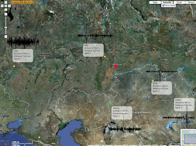 |
| Fig. 1 - Map view of the seismic stations used. Distance from the explosion, time after the explosion to a phase arrival, and arrival order (rank) are shown along with the seismogram. All seismograms begin at the instant of the explosion. |
It's common sense to expect the energy from the explosion to arrive at a later time at stations further away, which it does. Notice how the sharp peak corresponds to distance? We can actually make a plot of this and learn some more from the data. To do this, pick a feature that is easily identified in each waveform (we used the first trough) and record how many seconds after the blast it arrives at the instrument. We then plot that on the x-axis of a graph and the distance of the station from the blast on the y-axis. The result should be something like that shown in figure 2. Now we can use some basic math to figure out how fast this energy was traveling. The red line on the figure is the "best fit line" to the data. We use some basic statistics (a linear regression) to make this line, but any plotting program will do it for you. A line has a slope (how steep it is) and a y-intercept (where it touches the y-axis when x is zero). The slope of a line is how much the y values change per a certain change on the x axis, often taught as "rise over run" in the classroom. The slope of this line turns out to be about 3km/s. That's a pretty reasonable speed for surface waves (which these are) through the ground!
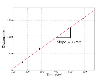 |
| Fig. 2 - The distance from the blast against arrival times. This data indicates the surface waves traveled about 3km/s, a reasonable speed. |
If we could pick out a "p-wave" in the data (difficult for reasons we will discuss), the intercept of the line would be the height above the ground that the blast happened. I haven't seen a really good estimate of the height, probably because the p-wave is hard to find and the speed of the meteorite. The meteorite was traveling about 40,000 mph when it exploded. It's hard to imagine something moving that fast, so let's change around the units: that's something like 11 miles every second!
The p-wave could be hard to see because 1) it's going to be relatively small, and 2) there are waves from an earthquake in Tonga arriving about the same time as the meteorite explosion. We know the waves we picked aren't from the tonga event, those would have arrived at all the stations at almost the same time because they were reflecting off the Earth's core. It would be an interesting project to play with trying to pick p-waves and/or estimate their arrival window by guessing the height of detonation.
We don't have to stop here though. This morning I saw this youtube video, a compilation of people recording the shockwave. The meteorite had streaked past, exploded, and they were recording this when the shock wave hit. Shockwaves behave in a funny way, but luckily it's been studied a lot by the government. Why? Nuclear weapons! Seismologists are commonly employed to determine if a nuclear test has taken place, and estimate it's size, location, etc. A lot of very interesting information on air-blast and it's interaction with buildings can be found in the book "The Effects of Nuclear Weapons". The book has lots of formulas and relations that could make many interesting lab exercises, but we'll just discuss reflection in this post.
A shock wave is really a front of very high air pressure that is propagating through some material. The high pressure is followed (in a developed shock wave) by a small, longer, suction, then a small overpressure. I've tried to locate meteorological observations and so far have only found hourly observations. If we can find short term observations we would expect to see wind rushing away from the blast, then more weakly towards it, then very weakly away from the blast. By knowing those wind velocities we could estimate the pressure differential that caused the shock. The local airport (station USCC) does report hourly average winds (data here). There is a small bump in the average winds between 9-10am local time, when the meteorite entered. The lack of a gust report though makes this observation a bit too shaky to use for a pressure estimate.
Shock waves move faster than the speed of sound if they are a high enough "overpressure", or the pressure above atmospheric. Shock waves will reflect off the ground when they reach it, as shown in figure 3. The overpressure in the region of "regular reflection" is much higher than the overpressure of the shock wave due to a combined stacking effect. There can also be complicating patterns such as "Mach Reflections".
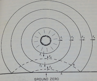 |
| Fig.3 - The initial pressure wave (solid lines) and the reflected shock (dashed lines). Image from "The Effects of Nuclear Weapons" |
What's interesting about all this is the audio of the clips at about 20 and 40 seconds into the YouTube video. Notice these clips contain two bangs. The first clip with two shocks could be reflection off the building behind the camera, the second shock follows the first very close and is very loud. The next clip has a significant delay though. At any height above the surface the initial reflection occurred on, there will be a delay between the initial and reflected shock. If we knew the location of this video it would help constrain the shock location. (After some google searching I can't locate the "Assorty" store in the footage anywhere.)
Overall with the observations of glass breaking over such a large area, we can assume the reflected pressure was probably in the area of 1psi. This means the initial overpressure was very small at the ground. Could you work backwards from the estimate of 500 kiltons TNT? Sure! That's a topic for another day or for your students in lab! Be sure to check out the book "The Effects of Nuclear Weapons", many campus libraries have it, Penn State has it online even.
Below is a link to a zip file that contains the .SAC files for the seismic stations (starting at detonation time and low pass filtered as well as raw data) and high quality figures. If I end up writing up a lab from the event, expect the data and lab to be on my academic website. A review of literature on the Tunguska event may be helpful as well!
Zip file of data.
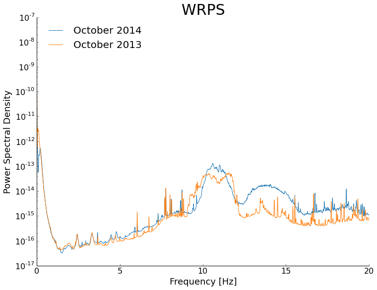
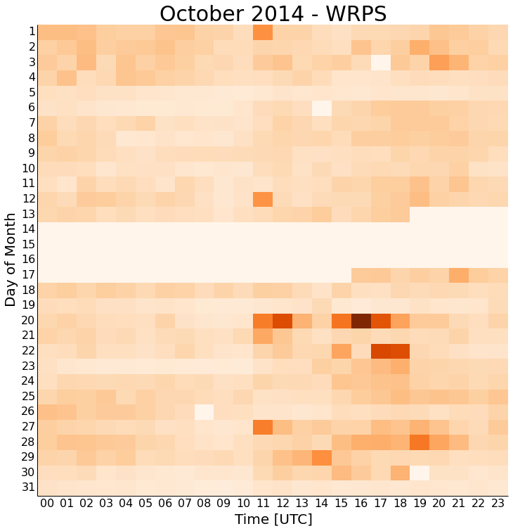 You'll immediately notice that there is always more noise starting about 11 UTC, which is the 7-8 AM hour locally. This is about when people are coming into work, vibrating the ground and buildings on campus as they do. The noise again seems to die off about 21 UTC or the 5-6 PM hour locally. This again makes sense with people leaving work and school. This isn't split finely enough to look for class change times on campus, but that could always be another project.
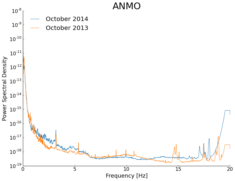