Category Archives: Geology

How Thick is the Crust?

Earth's Structure (Wikipedia)

Earth's Structure (Wikipedia)

I think the first time I really heard much about the Earth's crust was on the TV show "Bill Nye the Science Guy." (In fact, I was obsessive about not missing an episode as a child and I was ecstatic when I got to see Bill speak at Penn State last year.) He talked about earthquakes and Earth's structure, cut in with funny segments of a family telling their son, "Ritchie, eat your crust."

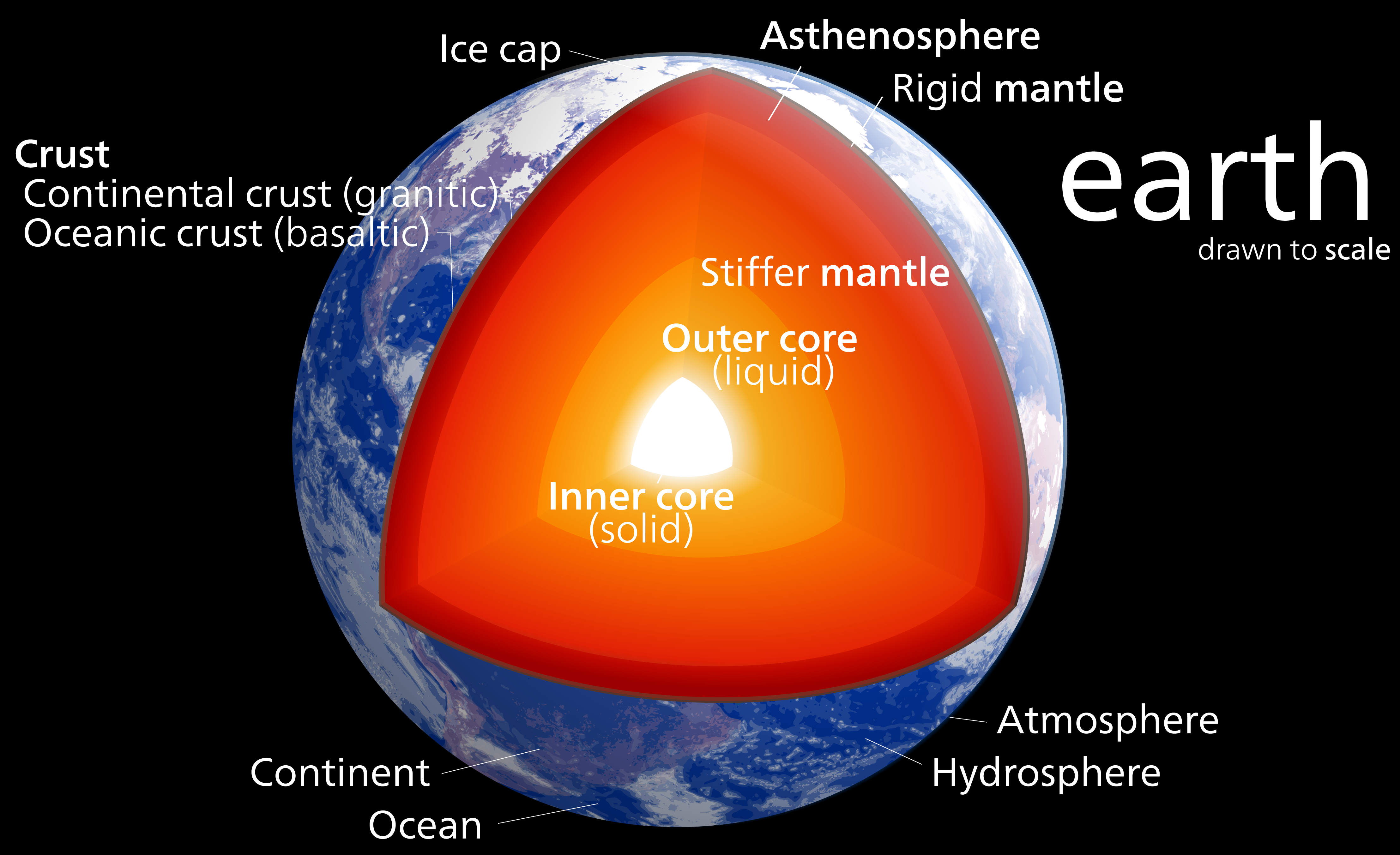
The crust in an interesting thing - it's what we live on top of and there are lots of interesting places where it's different due to geologic processes that concentrate certain types of materials. The crust is broken up into around a dozen major tectonic plates that move at about 4-6"/year. These plates are either oceanic or continental crust. Oceanic crust is generally relatively thin ~6 km (4 miles) and oceanic crust is much thicker at ~35 km (22 miles). The thin oceanic crust is also more mafic and dense than the felsic continental crust.

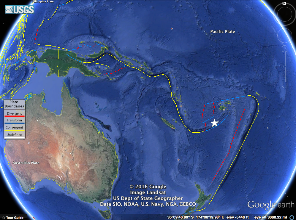
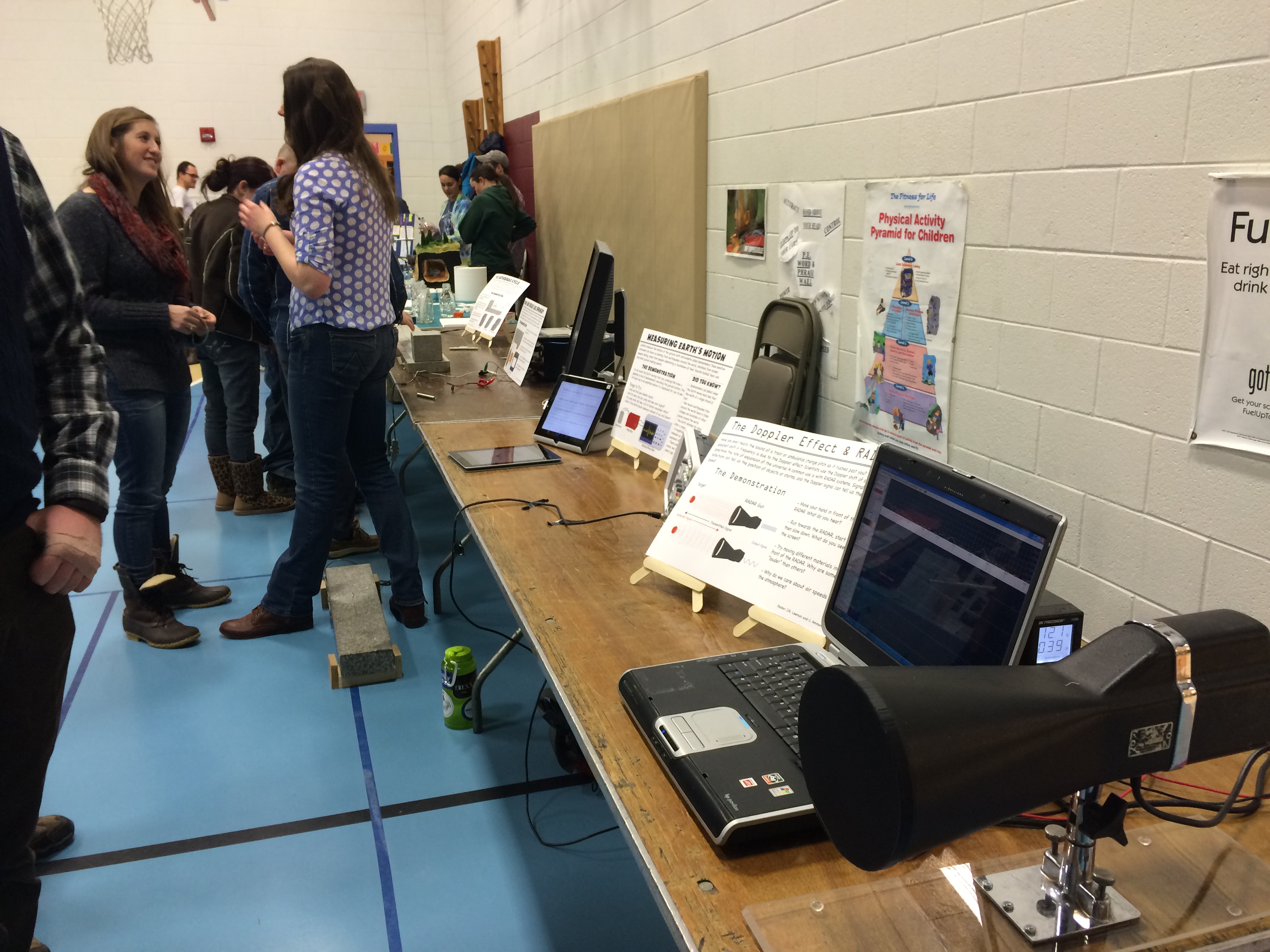
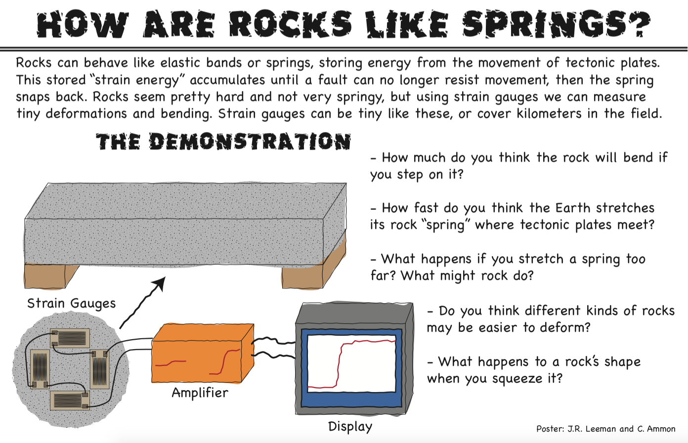
These differences create complex interactions when the plates meet each other at plate boundaries. We did a whole show on plate tectonics over at the Don't Panic Geocast recently, so if you'd like to hear about the discovery and arguments over plate tectonics you should check it out.

Today, I'd like to share a tool and Dr. Charles Ammon and I have made to visualize a crust model and allow anyone to explore the crust. All you need is Google Earth! We used a model called Crust 1.0 by Laske et al. that has how thick the crust (broken up into a few divisions) is for  64,800 points on the Earth along with some other crustal properties. That's every one degree of latitude and longitude! They put a lot of work into making this model. Generally we would use a Fortran program to get values out of the model, but Dr. Ammon had an idea to visualize the data in a more intuitive way with Google Earth. Over the Thanksgiving holiday I wrote a Python utility to access the model values and then we wrote a simple script that generates a Google Earth KML file based on the model.

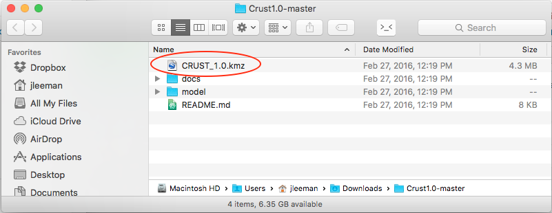
All you have to do is head over to the project's GitHub page and click the "Download ZIP" button. While you're waiting on the download you can scroll down and read all about the development, the model, and find activities to try. Next, open folder you downloaded (most operating systems will automatically unzip it for you now) there will be several files, but the only one you need is the CRUST_1.0.kmz file.

Screenshot 2016-03-12 07.29.51

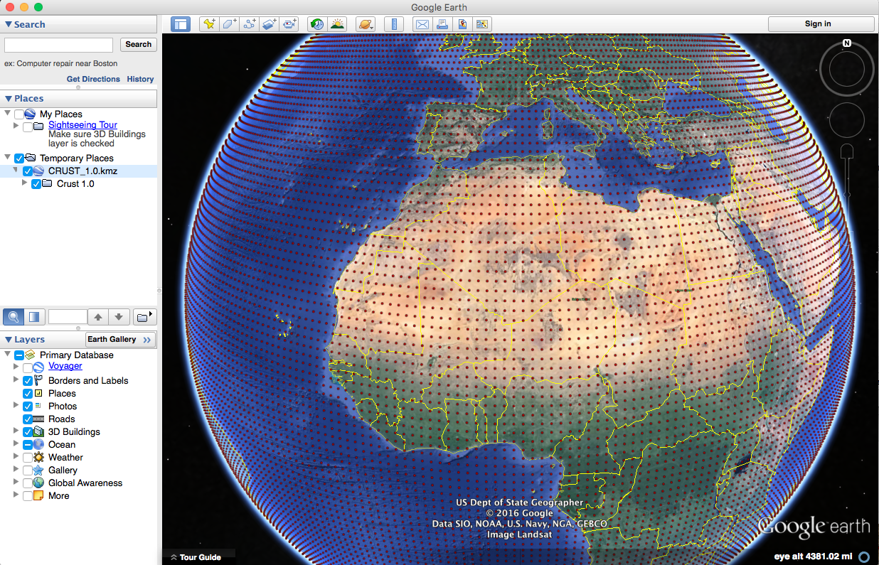
As long as you have Google Earth installed, double click that file and you'll see the Earth appear covered in red dots. If you zoom out too far, they will disappear though!

Screenshot 2016-03-12 07.31.49

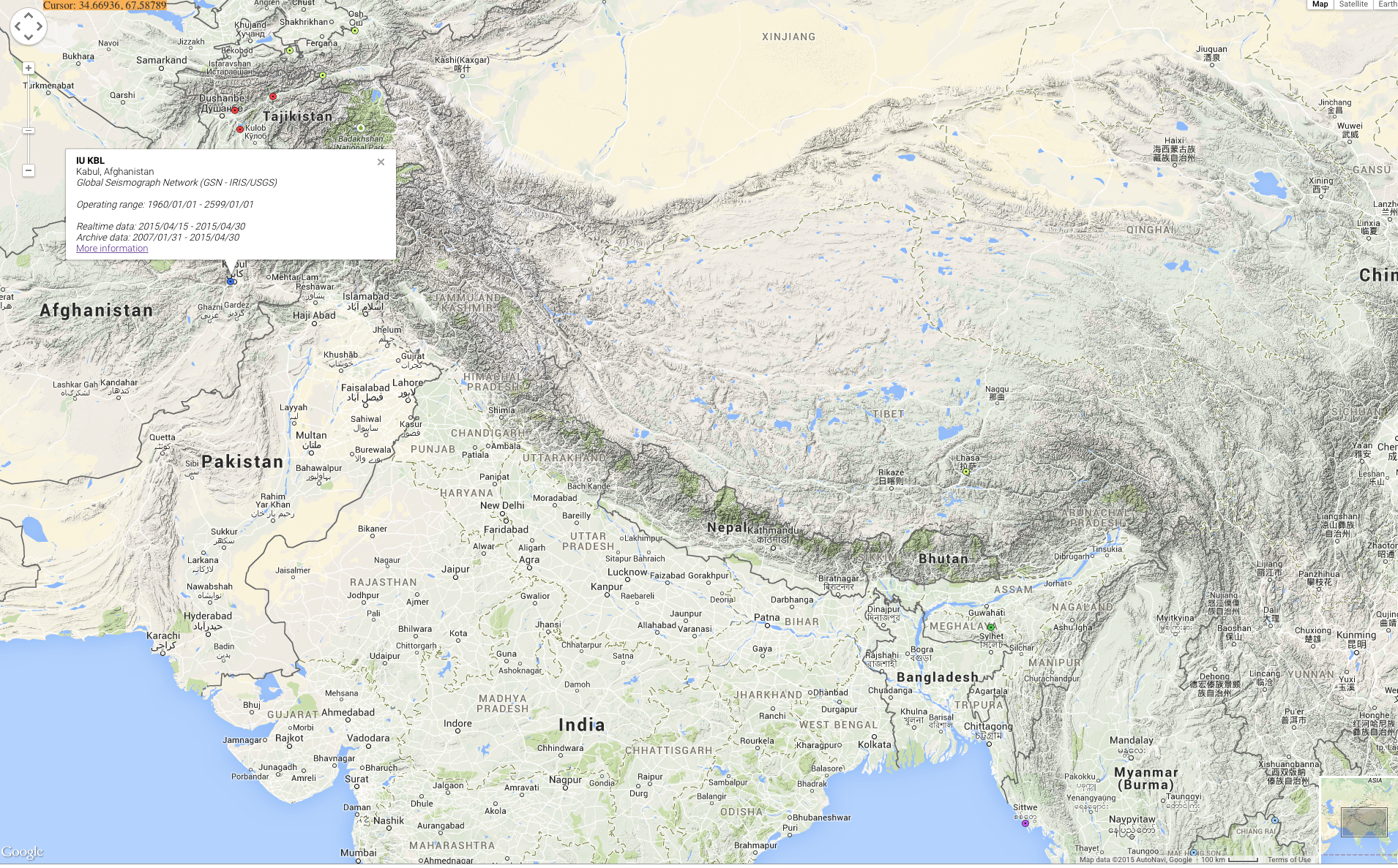
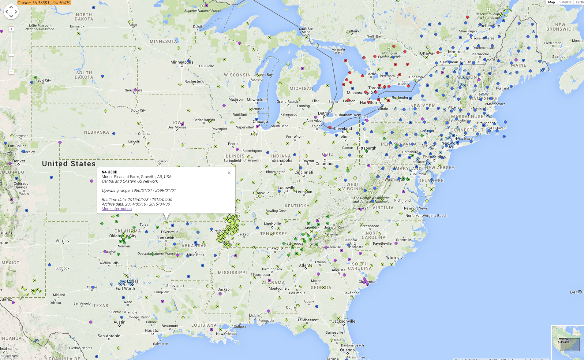
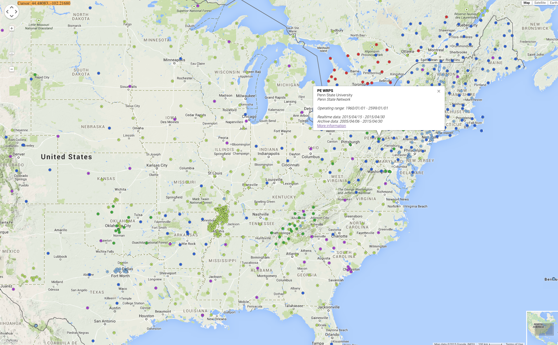
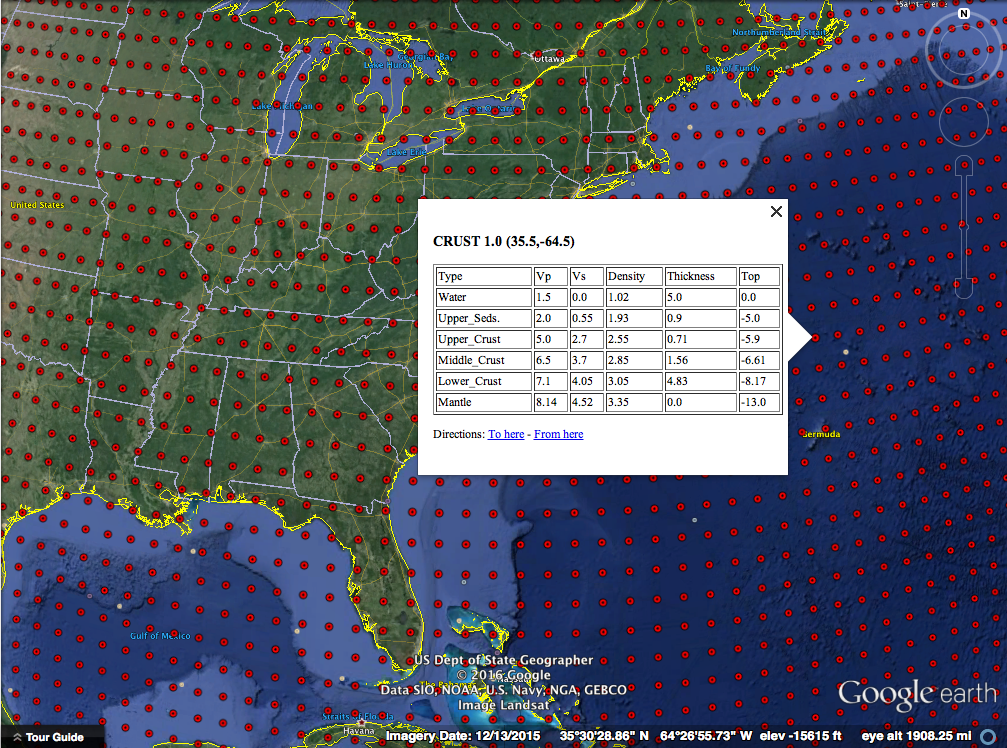
Each red dot is a location where the model has the average crustal properties like how fast P and S seismic waves can travel and the density. All of these are explained in more detail on the project webpage. You should also try some of the projects we have listed there! As a starter, let's look at oceanic and continental crust and verify my assertion about their 3x thickness difference.

Clicking out in the Atlantic Ocean (make sure you are not on the continental shelf) we see about 13 km thick crust (the top of the mantle number). The water depth is also handy to have on-hand sometimes.

Screenshot 2016-03-12 07.35.15

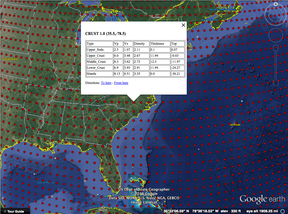
Clicking well onto the North American plate we see about 36 km thick crust. Next you should head over to mountainous regions and basins and see how the structure of the crust is different - why is that? Sorry, no homework answers here!

Screenshot 2016-03-12 07.35.26

This is a really fun way to learn about the crust and a good reference tool as well! There are flyers in the docs folder that you can print to use as teaching aids or handout to students! We had a lot of fun making this 1-day project and hope that you'll explore it and let us know what you think! A big thanks to the folks that did the massive amount of work making the model - we just made it visible in Google Earth! Everything is open-source as always.

Tracking Earthquakes Across the Globe - Travel Times

A few days ago I had the Epicentral+ app running on my iPad sitting on my desk and saw an event come on the screen. By looking at what stations were measuring ground movement first, second, third, etc. I could make a good guess at the event's location. Did you know that, with the data from a single seismic station, you can begin to guess the epicenter?

Generally earthquake locations are performed using many stations and algorithms that have been tweaked for years as we want to get ever more accurate locations. The USGS does this location for many events every day. It's fun to keep a live feed of the global seismic data up and look at the patterns. This is possible thanks to applications like "Earth Motion Monitor" and "Epicentral+", both products of Prof. Charles Ammon. They are worth installing and having a look. Prof. Ammon has seen the value in being able to watch signals for long periods of time: you begin to pick out patterns and get an intuitive feel for the response seen due to different events. While I don't have nearly the amount of insight possessed by experienced seismologists, I wanted to show you a quick and simple way to figure out about how far an event was from a given station. If you combine that with some geologic knowledge of where plate boundaries are, you can likely narrow down the region and earthquake type before anything comes out online.

The event I saw is a pretty small event, a magnitude 5.8 near the Fiji islands; it'll work for our purposes and not provide too much distraction. I've marked it with a white star on the map below (a Google Earth map with the USGS plate boundary file). This event occurred near the North New Hebrides trench, part of a slightly complex zone where the Australian plate is being pushed under, or subducted, beneath the Pacific plate.

Our earthquake in question marked with a white star near the North New Hebrides trench.

Our earthquake in question marked with a white star near the North New Hebrides trench.

Though the event was not huge, it was detected by many seismometers around the globe. In fact, there is a handy map of the stations with adequate signal automatically generated by IRIS. The contour lines on the map show distance from the event in degrees (more on that later).

Stations and their distance from the earthquake. (Image: IRIS)

Stations and their distance from the earthquake. (Image: IRIS)

I saved an image of assorted global seismic stations about an hour after the event occurred. You can see energy from the earthquake recorded on all stations, with some really nice large packets of surface waves (the largest waves on the plot).

raw_seismograms

We're actually interested in the first two signals though, the classic P and S waves. Let's take a closer look at the station in Pohakuloa, Hawaii. We can see the first arrival, the P-wave, then a few minutes later the S-wave. The P-wave (a compressional, basically a sound-wave) travels faster than the transverse S-wave, so they arrive at different times. We know the wave speeds with depth in the Earth, so by using the difference in time between these arrivals, we can come up with a rough distance to the event.

seismograms_annotated

A graph of distance vs. arrival times can tell us the whole story. I've made a simple version in which you can find the time we measured (7.25 minutes) on the x-axis, then lookup the distance on the y-axis. If we do this (marked in dashed black lines), we see that the distance should be about 50 degrees.

SmP_time_curve

That's not bad! I calculated the actual distance knowing the earthquake location and station location to be 49.6 degrees. The theoretical difference in travel time based on a simple Earth model is 7.14 minutes. The slight error is due to a complex real Earth, but mostly due to me picking a rough time on an iPad screen without really zooming in on the plot. The goal was to know about how far away the earthquake was from the station though, and we did that with no problem. Just from that information it was easy to tell that the event was in the Fiji region.

Distance is in degrees, which may seem a little strange. Since the Earth is a ball-like blob, defining distances across the surface is a little tricky when distances get large. It turns out to be more convenient to think of this distance as an angle made with the center of the earth. Take a look at the screenshot below. It's from a program called taup and shows the actual paths taken by the P and S waves through a cut-away of the Earth. I've marked the angle I'm talking about with the greek letter ∆. (We would formally say that this is the great circle arc distance in degrees. If you want to learn more about great circle arcs, you should checkout our two part podcast on map projections.)

taup_path_annotated

As scientists, we often look at a travel time plot a little differently. There are many different waves or "phases" that we are interested in, so plotting one line of  S-P wave arrival is rather limiting. Instead we plot a classic "travel time curve" where the arrival time after the event is plotted as a function of distance. I've reproduced one below (table of data plotted from C. Ammon).

travel_time_curve

We can make a plot like this from data too! Taking many stations, plotting them as a function of distance we get a plot like the one below. You can see curved and straight lines if you stand back and squint a little. Those are arrivals of different phases across the globe! Notice the lower curved line that matches the P-wave travel time above.

Notice the lines and curves made as different phases from the earthquake arrive across the globe. (Image: IRIS)

Notice the lines and curves made as different phases from the earthquake arrive across the globe. (Image: IRIS)

Like I mentioned, there are many different phases we can look at. To give you an idea of things a seismologist would look for, there is a version of the plot with a lot of the more complex phases marked on it below. I know it looks intimidating, but for this event, you'll see we really can't easily discern a lot of the phases. That's because this really isn't a huge event, but it's nice for us because that means the plot is easier to look at.

Arrival plot with phases marked. (Image: IRIS)

Arrival plot with phases marked. (Image: IRIS)

So there you have it, by remembering the rough travel time curves or posting one on your wall, you can quickly determine the approximate region an earthquake occurred in just by glancing at the seismograms!

Magnitude 7.1 Alaska Earthquake Visualizations

This morning there was a magnitude 7.1 earthquake beneath Alaska. Alaska is no stranger to earthquakes, and I'm not going to talk about the tectonics, but I wanted to share the ground motion videos I produced for the event. Also be sure to checkout the ground motion videos over at IRIS as well. At present no major damage or injury was reported. Though CNN did sensationalize the earthquake (as they always do):

Screenshot 2016-01-24 07.20.30

First a video from a nearby station, Homer, AK. About 8 mm maximum ground displacement with some pretty large ground accelerations.

The earthquake recorded in Australia. Not as exciting, but notice the packets of waves towards the end of the video, these are the surface waves that took the longer route around the globe compared to their earlier counter parts. (Called R1/R2 and G1/G2.)

Here's a central US station near where I grew up. Nice surface waves and a good example of what looks like the PcP phase (P-wave reflected off the outer core of the planet.) The PcP phase is at about 604 seconds, around 100 seconds after the P wave. In the figure below the movie, the approximate PcP path is red, the P path is black. Pretty neat!

Screenshot 2016-01-24 13.32.59


Squeezing Rocks with your Bare Hands

Our lab group. Photo: Chris Marone

Our lab demo group. Photo: Chris Marone

As frequent readers of the blog or listeners of the podcast will know, I really like doing outreach activities. It's one thing to do meaningful science, but another entirely to be able to share that science with the people that paid for it (taxpayers generally) and show them why what we do matters. Outreach is also a great way to get young people interested in STEAM (Science, Technology, Engineering, Art, Math). When anyone you are talking to, adult or child, gets a concept that they never understood before, the lightbulb going on is obvious and very rewarding.

Our lab group recently participated in two outreach events. I've shared about the demonstrations we commonly use before when talking about a local science fair. There are a few that probably deserve their own videos or posts, but I wanted to share one in particular that I improved upon greatly this year: Squeezing Rocks.

Awhile back I shared a video that explained how rocks are like springs. The normal demonstration we used was a granite block with strain gauges on it and a strip chart recorder... yes... with paper and pen. I thought showing lab visitors such an old piece of technology was a bit ironic after they had just heard about our lab being one of the most advanced in the world. Indeed when I started the paper feed, a few parents would chuckle at recognizing the equipment from decades ago. For the video I made an on-screen chart recorder with an Arduino. That was better, but I felt there had to be a better way yet. Young children didn't really understand graphs or time series yet. Other than making the line wiggle, they didn't really get the idea that it represented the rock deforming as they stepped on it or squeezed it.

I decided to go semi old-school with a giant analog meter to show how much the rock was deformed. I wanted to avoid a lot of analog electronics as they always get finicky to setup, so I elected to go with the solution on a chip route with a micro-controller and the HX711 load cell amplifier/digitizer. For the giant meter, I didn't think building an actual meter movement was very practical, but a servo and plexiglass setup should work.

A very early test of the meters shows it's 3D printed servo holder inside and the electronics trailing behind.

A very early test of the meters shows it's 3D printed servo holder inside and the electronics trailing behind.

Another thing I wanted to change was the rock we use for the demo. The large granite bar you stepped on was bulky and hard to transport. I also though squeezing with your hands would add to the effect. We had a small cube of granite about 2" on a side cut with a  water jet, then ground smooth. The machine shop milled out a 1/4" deep recess where I could epoxy the strain gauges.

Placing strain gauges under a magnifier with tweezers and epoxy.

Placing strain gauges under a magnifier with tweezers and epoxy.

Going into step-by-step build instructions is something I'm working on over at the project's Hack-a-Day page. I'm also getting the code and drawings together in a GitHub repository (slowly since it is job application time). Currently the instructions are lacking somewhat, but stay tuned. Checkout the video of the final product working below:

The demo was a great success. We debuted it at the AGU Exploration Station event. Penn State even wrote up a nice little article about our group. Parents and kids were amazed that they could deform the rock, and even more amazed when I told them that full scale on the meter was about 0.5µm of deformation. In other words they had compressed the rock about 1/40 the width of a single human hair.

A few lessons came out of this. Shipping an acrylic box is a bad idea. The meter was cracked on the side in return shipping. The damage is reparable, but I'm going to build a smaller (~12-18") unit with a wood frame and back and acrylic for the front panel. I also had a problem with parts breaking off the PCB in shipment. I wanted the electronics exposed for people to see, but maybe a clear case is best instead of open. I may try open one more time with a better case on it for transport. The final lesson was just how hard on equipment young kids can be. We had some enthusiastic rock squeezers, and by the end of the day the insulation on the wires to the rock was starting to crack. I'm still not sure what the best way to deal with this is, but I'm going to try a jacketed cable for starters.

Keep an eye on the project page for updates and if any big changes are made, you'll see them here on the blog as well. I'm still thinking of ways to improve this demo and a few others, but this was a giant step forward. Kids seeing a big "Rock Squeeze O Meter" was a real attention getter.

Hmm... As I'm writing this I'm thinking about a giant LED bar graph. It's easy to transport and kind of like those test your strength games at the fair... I think I better go parts shopping.

Nepal Earthquake Ground Motion Around the World

The recent earthquake in Nepal is truly a tragic event. Currently it has claimed over 5000 lives and the more remote regions will not be reached for days to weeks. It is really very hard to comprehend the intensity of ground motion for such an event. If you want to know more technical details about the event, I encourage you to look at the official USGS event page and Chuck Ammon's blog post. We also will talk about earthquake details on the "Don't Panic Geocast" tomorrow (Friday).

For now I wanted to share some animations of the ground motion associated with the event. I tweeted some of these earlier in the week and got a great response, so I wanted to collect them all in one place with some maps. First off a quick map of the main shock and many aftershocks (circle area goes with the magnitude, color the age).

2015-04-30 10.37.19

Let's start with a ground motion visualization from a station in Tibet, China. This station "clipped". This means the instrument hit the limits of the motion it could measure. This particular station is about 650 km (400 miles) from the earthquake. There is another instrument that measures strong motion closer to the earthquake, but the data had some holes that made animation very difficult. (I guess that's another feature to add to the program!)

Screen Shot 2015-04-30 at 10.40.56 AM

Next, we look a little further away at Kabul. While the shaking wasn't very strong (much smaller accelerations), we begin to see more interesting waveforms as phases are getting separated by traveling a greater distance of 1650 km (1025 mi).

Screen Shot 2015-04-30 at 10.41.07 AM

If we move much further away to the U.S., we see a very long record of motion. I made two animations for the U.S., one near where I grew up in Arkansas and one from the instrument in the basement of the geology building here at Penn State. There are some really great Rayleigh waves (the circular motion) around 3:51 in the Arkansas video and 3:18 in the Pennsylvania video.

Screen Shot 2015-04-30 at 10.41.36 AM

Screen Shot 2015-04-30 at 10.41.44 AM

I hope you find these videos interesting! There is a lot of possible post material in each one, but I wanted to be sure to get them out in a timely and collected way. The program to make these is completely open source on GitHub: https://github.com/jrleeman/SeismoVisualize and was inspired by the visualization of Mike Cleveland and Chuck Ammon.

Going to the Science Fair

2015-02-23 19.16.17

Explaining doppler RADAR with an actual demo!


This past week I got to relive some of my favorite days of primary education: the science fair!  A local elementary school was hosting their annual science fair and had asked the department to provide some demonstrations for the parents and students to see. I immediately volunteered our lab group and began to gather up the required materials. Some of the setups were made years ago by my advisor. I also developed a few and improved upon others here and there. I thought it would be fun to share the experience with you.

2015-02-23 18.09.58

The line-up of demonstrations setup as the science fair was getting started.


At some point, we should probably have a post or two about each of these demonstrations, but today we'll look at pictures and talk about the general feedback I received. First, off we had four demonstrations including the earthquake cycle, how rocks are like springs, seismometers, and Doppler RADAR. I made an 11x17" poster for each demo in Adobe Illustrator using a cartoon technique that one of our professors here shared with me.

Screenshot 2015-02-28 14.41.01

Here is an example poster from one of the demonstrations.


For scientists, communicating with the public can be difficult. It's easy for us to get holed up in our little niche of work and forget that talking about a topic like power spectra isn't everyday to pretty much everyone. Outreach events like this present a great opportunity to work on those skills! This particular event was especially challenging for me because the children were K-5, much younger than I usually talk to. With high school students you can maybe talk about the frequency of a wave and not get too many lost looks, but not with grade-schoolers!

The other difficulty was adapting what are deep topics (each demo is an entire field of research, or several) to the short attention span we had to work with. Elementary school teachers are masters of this and I would love to get some ideas from them on how to work with the younger minds. I spent most of my time talking about the Doppler effect with the RADAR (it's the topic my lab mates were least comfortable with since we don't deal with RADAR at work generally). By the end of the science fair, I had an explanation down that involved asking the kids to wave their hand slowly and quickly in front of the RADAR and listen to how the pitch of the output changed. Comparing that to the classic example of the pitch bending of a passing fire truck siren seemed to work pretty well. I had a "waterfall" spectra display that showed the measured velocity with time, but other than trying to get the line to go higher than their friends, it didn't get much science across (though lots of healthy competition and physical exercise was encouraged).

2015-02-23 18.16.49

An excited student jumps up and down to see herself on a geophone display.


In the past, I've pointed out the value of being an "expert generalist". All of us were tested in any possible facet of science by questions from the kids and their parents. I ended up discussing gravitational sling-shot effects on space probes with a student and his parents who were incredibly interested in spaceflight. I also got quizzed about why the snow forecasts had been so bad lately, when the next big earthquake would be, and a myriad of other questions. Before talking to any public group, it's also good to make sure you are relatively up-to-date on current events, general theory, and are ready to critically think about questions that sound deceptively simple!

The last point I want to bring up today is the idea of comparisons. These are numbers that one of my committee members likes to say he "carries around in his shirt pocket." These are numbers that let us, as scientists, relate to others that are non-specialists and give us some physical attachment to a measurement.  What do I mean? Let's say that I tell you that tectonic plates move anywhere from 2-15 cm/year. Great, first, since we are in the U.S.A., everyone will hold out their fingers to try to get an idea of what this means in imperial units.... not quite 1-6 in/year. That's better, but a year is a long time and I can't really visualize moving that slowly since nothing I'm used to seeing everyday is that slow... or is it? Turns out that fingernails, on average, grow 3.6 cm/year and hair grows about 15 cm/year. Close enough! In Earth science we have lots of approximate numbers, so these tiny differences are not really that bad. Now let's revise our statement to the kids to say: "The Earth is made of big blocks of rock called plates. These move around at about the speed your finger nails or hair grow!" Now it is something that anyone can relate to, and next time they clip their nails or get a hair cut, they just might remember something about plate tectonics! It's not about having exact figures in the minds of everyone, it's about providing a hand-hold that anybody can relate to! This deserves a post to itself though.

That's all for now, but I'd love to hear back from anyone who has elementary education experience or has their own "shirt pocket numbers."


Don't Panic Geocast - Now on Your Radio!

DSCF4046

I would like to announce the official release of the first episode of the "Don't Panic Geocast!" This is something that has been in the works since earlier this summer. Each week Shannon Dulin and I will be discussing geoscience (geology, meteorology, etc) and technology. Please be sure to add us to your feeds and checkout our first show!

Napa Valley Earthquake - Aug. 24, 2014

As I'm sure you've heard/read by now, there was a moderate earthquake in the Napa Valley region of California earlier today. At 3:20 AM a fault ruptured producing a magnitude 6.0, the largest for that area since 1989. So far the damage pictures I've seen coming out of the area show moderate to severe structure damage on older structures and lots of toppled book shelves and wine racks.

This earthquake has nearly a textbook slip pattern or focal mechanism. The plot below is often called the "beach ball plot" and is a way to represent how the fault moved. Without going into the details of how we construct a plot like this, we can simply interpret what we see. This plot shows a traditional strike-slip motion. This means that the plates slid past each other laterally with little motion up and down on the fault. This doesn't mean that there will be no up and down motion as the seismic waves propagate though!

Focal Mechanism Solution (usgs.gov)

Focal Mechanism Solution (usgs.gov)

We can also interpret from this beach ball that the strike-slip motion was right-lateral. If we were standing out in the ocean looking towards the other side of the fault inland California, we would see things shift to the right. This makes sense with the tectonics there as the pacific plate is grinding northwest past the North American plate. The locked plates bend and deform storing elastic strain energy, then finally fail, snapping into a state of lower stress. I've shown this elastic property of rocks before, but we have yet to really discuss the earthquake cycle in detail. Maybe one day soon I'll do some demonstrations about that though!

The final piece of the earthquake story I want to show you is a movie of the ground motion experienced at a seismometer in the Marconi Conference Center, Marshall, CA. This video shows what we would see if we could track a piece of the ground in 3D and watch it's motion as different seismic waves go by. There is lots of information in this plot, but for now just notice the large amounts of motion!  This is three minutes of data with 4 ground positions recorded per second in real time, then sped up.

As always, if you do happen to live in an earthquake prone area, be sure to have a plan, have an emergency kit, and always be prepared for any natural disaster!


Are Rocks like Springs? A Video Demonstration

Today I was getting a demo in the lab ready for a tour group and decided to try shooting a quick, unscripted bit on rocks as springs.  There are a few generalized statements in here, but overall it is a first try at a public education video.  Comments welcome!

It's All About the Waves - 2014's First Magnitude 7+ Event in Chile

There's been a decent amount of chatter amongst Earth scientists that it has been a long time since the last magnitude 7 or greater earthquake.  In fact, there hadn't even been one in 2014 until last night.  The earthquake is currently rated an 8.2 (mww) and occurred in a well known seismic gap that has been published on a decent amount in recent years.  The last major earthquake in North Chile was an 8.6 in 1877! Many smaller earthquakes in the area over the last weeks have kept everyone on their toes.

This location in Chile marks a major plate boundary where the Nazca plate is subducting, or being pushed under the South American plate.  The idea of subduction is that the two plates are being forced together and one ends up getting pushed underneath the other.  In this case, the cold and dense oceanic crust gets pushed underneath the less dense continental crust.  As we would expect, this means that the earthquakes occur on a very shallow angle thrust.  Moment tensor solutions can tell us about the fault by analyzing many seismograms.  Turns out that the moment tensor solution looks like about a 12-18 degree dip on the fault, not out of line with our prediction.  There are a lot more of the advanced scientific products such as the moment rate function here.  It looks like the rupture lasted for around 100 seconds and slipped a maximum of 6.5 meters (21 ft.) at a depth of near 30 km (18.6 miles).  The earthquake started a little more shallow though, about 20 km (12 miles) down.

There have been many aftershocks with the event, some sizable.  At the bottom of the post I've provided a channel list that I'm using to watch the aftershock sequence on the EpiCentral app (for iPad).  What I want to show are the buoy data though!  When a large earthquake of this type occurs, waves are generated in the ocean and the folks at the Pacific Tsunami Warning Center go into action.  There were some significant waves near Chile (about 2m/6.5 ft.).  It looks like, for the time being, most other locations such as Hawaii may be in the clear.  As I'm writing this the remnants of the waves should reach Hawaii in the next few hours.  Below is a rough travel time map from NOAA.

ChileTsunamiTravelTime

A list of the observations from the  warning center can be found in their most recent statement.  We can actually access the buoy data and look at the wave propagating across the ocean though!

When waves propagate across the water (or many other media) they often experience a phenomena called dispersion.  The idea is that waves are actually made of many frequency components, or notes if you will.  Because of some physics funny business, the longer period (lower frequency) waves will actually travel faster than the short period (high frequency) waves.  We can see this in the data below.  I'm showing two stations for sealevel.  They have different types of sensors, but that's not too important.  Be sure to click on the plot to see it full size (the link will open in a new window/tab)!

Wave_dispersion

We see exactly what theory predicts, long period waves coming in first, followed by progressively shorter period waves.  We also see that stations further out don't see the high frequency waves.  This is another phenomena in which the medium filters out high frequency waves over the travel.  We would say that the high frequency waves have been strongly attenuated.

That's all for now! Thank you for sticking with me through some interesting observations of predictions from math and physics!

Channel List:
C;GO01; --;BHZ;VERTICAL,CHUSMIZA, CHILE
C;GO01; --;BHE;EAST-WEST, CHUSMIZA, CHILE
C;GO01; --;BHN;NORTH-SOUTH, CHUSMIZA, CHILE
IU;LVC; 00;BHZ;VERTICAL, LIMON VERDE, CHILE
IU;LVC; 00;BHE;EAST-WEST, LIMON VERDE, CHILE
IU;LVC; 00;BHN;NORTH-SOUTH, LIMON VERDE, CHILE
C;GO02; --;BHZ;VERTICAL,MINA GUANACO, CHILE
C;GO02; --;BHE;EAST-WEST, MINA GUANACO, CHILE
C;GO02; --;BHN;NORTH-SOUTH, MINA GUANACO, CHILE