Category Archives: Radar

Going to the Science Fair

2015-02-23 19.16.17

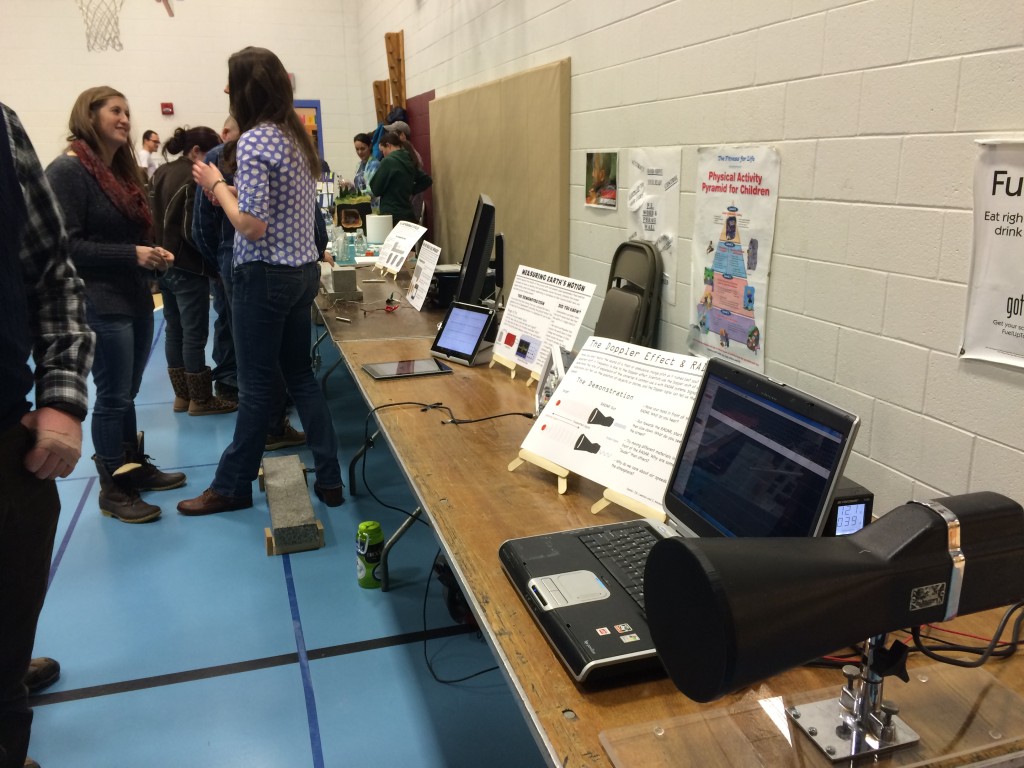
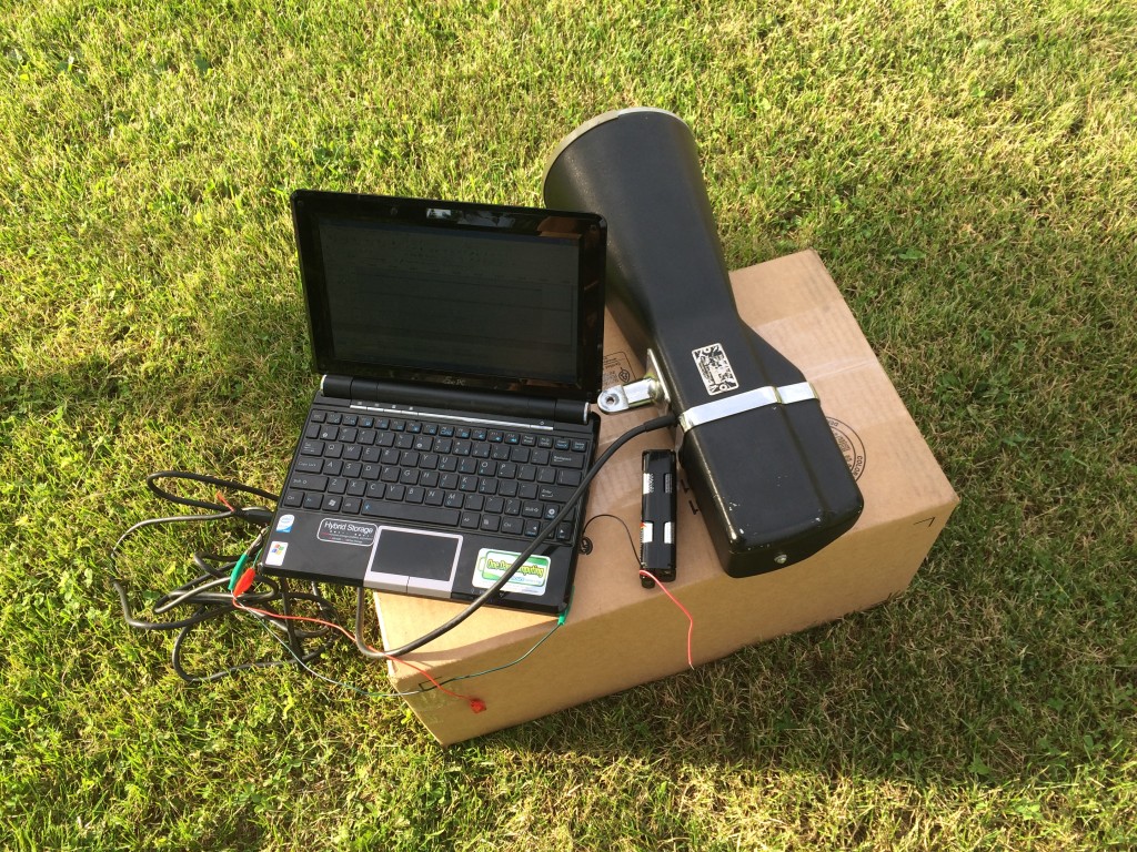
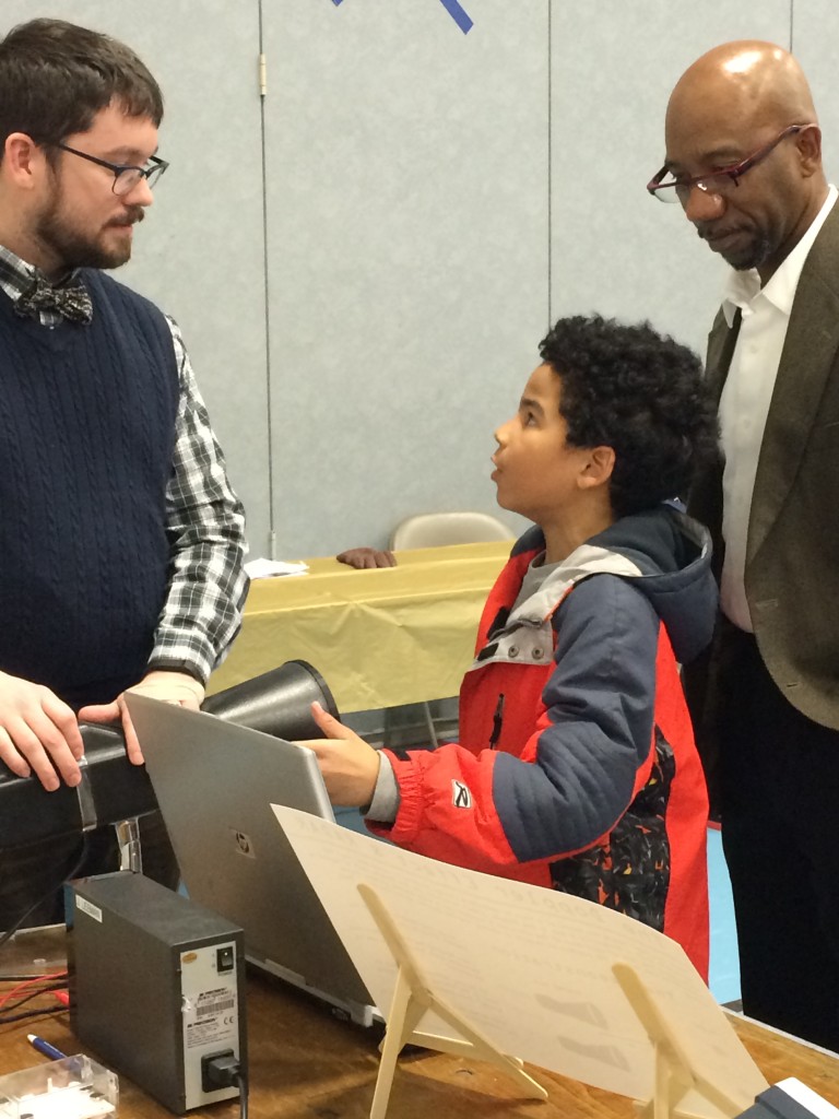
Explaining doppler RADAR with an actual demo!


This past week I got to relive some of my favorite days of primary education: the science fair!  A local elementary school was hosting their annual science fair and had asked the department to provide some demonstrations for the parents and students to see. I immediately volunteered our lab group and began to gather up the required materials. Some of the setups were made years ago by my advisor. I also developed a few and improved upon others here and there. I thought it would be fun to share the experience with you.

2015-02-23 18.09.58

The line-up of demonstrations setup as the science fair was getting started.


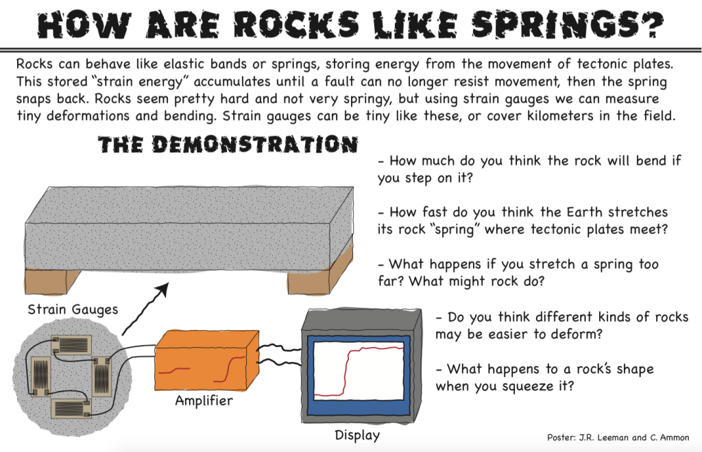
At some point, we should probably have a post or two about each of these demonstrations, but today we'll look at pictures and talk about the general feedback I received. First, off we had four demonstrations including the earthquake cycle, how rocks are like springs, seismometers, and Doppler RADAR. I made an 11x17" poster for each demo in Adobe Illustrator using a cartoon technique that one of our professors here shared with me.

Screenshot 2015-02-28 14.41.01

Here is an example poster from one of the demonstrations.


For scientists, communicating with the public can be difficult. It's easy for us to get holed up in our little niche of work and forget that talking about a topic like power spectra isn't everyday to pretty much everyone. Outreach events like this present a great opportunity to work on those skills! This particular event was especially challenging for me because the children were K-5, much younger than I usually talk to. With high school students you can maybe talk about the frequency of a wave and not get too many lost looks, but not with grade-schoolers!

The other difficulty was adapting what are deep topics (each demo is an entire field of research, or several) to the short attention span we had to work with. Elementary school teachers are masters of this and I would love to get some ideas from them on how to work with the younger minds. I spent most of my time talking about the Doppler effect with the RADAR (it's the topic my lab mates were least comfortable with since we don't deal with RADAR at work generally). By the end of the science fair, I had an explanation down that involved asking the kids to wave their hand slowly and quickly in front of the RADAR and listen to how the pitch of the output changed. Comparing that to the classic example of the pitch bending of a passing fire truck siren seemed to work pretty well. I had a "waterfall" spectra display that showed the measured velocity with time, but other than trying to get the line to go higher than their friends, it didn't get much science across (though lots of healthy competition and physical exercise was encouraged).

2015-02-23 18.16.49

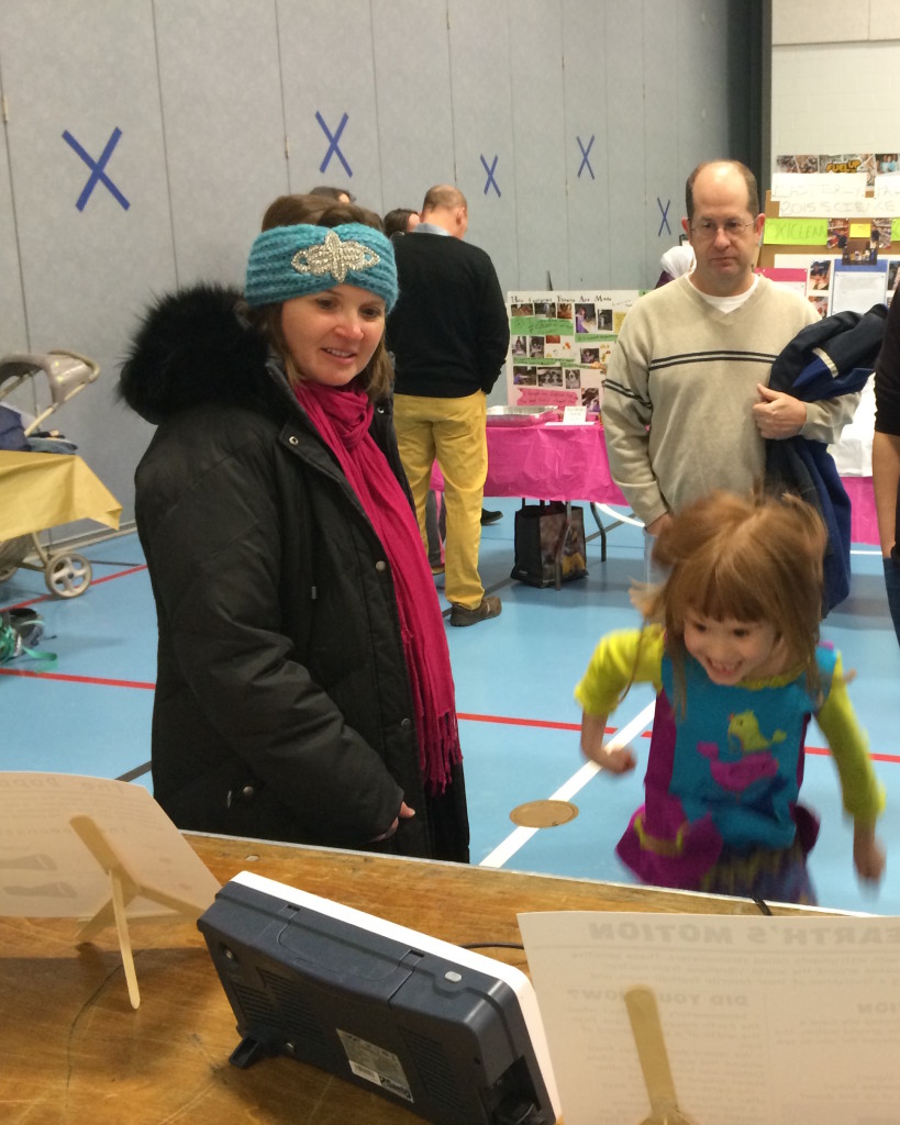
An excited student jumps up and down to see herself on a geophone display.


In the past, I've pointed out the value of being an "expert generalist". All of us were tested in any possible facet of science by questions from the kids and their parents. I ended up discussing gravitational sling-shot effects on space probes with a student and his parents who were incredibly interested in spaceflight. I also got quizzed about why the snow forecasts had been so bad lately, when the next big earthquake would be, and a myriad of other questions. Before talking to any public group, it's also good to make sure you are relatively up-to-date on current events, general theory, and are ready to critically think about questions that sound deceptively simple!

The last point I want to bring up today is the idea of comparisons. These are numbers that one of my committee members likes to say he "carries around in his shirt pocket." These are numbers that let us, as scientists, relate to others that are non-specialists and give us some physical attachment to a measurement.  What do I mean? Let's say that I tell you that tectonic plates move anywhere from 2-15 cm/year. Great, first, since we are in the U.S.A., everyone will hold out their fingers to try to get an idea of what this means in imperial units.... not quite 1-6 in/year. That's better, but a year is a long time and I can't really visualize moving that slowly since nothing I'm used to seeing everyday is that slow... or is it? Turns out that fingernails, on average, grow 3.6 cm/year and hair grows about 15 cm/year. Close enough! In Earth science we have lots of approximate numbers, so these tiny differences are not really that bad. Now let's revise our statement to the kids to say: "The Earth is made of big blocks of rock called plates. These move around at about the speed your finger nails or hair grow!" Now it is something that anyone can relate to, and next time they clip their nails or get a hair cut, they just might remember something about plate tectonics! It's not about having exact figures in the minds of everyone, it's about providing a hand-hold that anybody can relate to! This deserves a post to itself though.

That's all for now, but I'd love to hear back from anyone who has elementary education experience or has their own "shirt pocket numbers."

 

Raindrops Keep Falling on my Radar - Part 2

Last time we looked at the raindrop fall speed of raindrops during a thunderstorm and compared the radar reflected power to my observations of the storm moving through State College. Today, thanks to Yvette Richardson and Bill Syrett from the Penn State Meteorology Department, we can compare the radar returns to actual weather station data. They were able to provide data from a weather station on top of the meteorology building on campus, about 3 miles from where my radar was located.

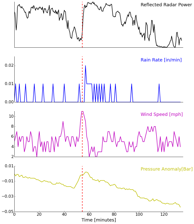
We expect more power to be returned to the radar during periods of heavy rain, so the main variable of interest is the rain rate. We'll plot up a couple of other meteorological variables just for fun as well. The weather station recorded observations every minute. I had to venture my best guess at the units based on their values. The rain rate values are low. Another station that I don't have the time-series for reported a maximum rain rate of 0.26 in/hr. Either way, let's examine the relative changes.

rain_wx_data_graph


Looking at the plot we can see that our prediction of higher rain rate equaling more reflected power holds. Unfortunately, the weather station didn't record precipitation rate with very fine resolution, so we really can only match the peak rain rate with the peak reflected power. The vertical red line marks the time of a weather service doppler radar screenshot we looked at in the last post that was right before the heaviest rain arrived. We also observe the higher wind speeds with the gust front ahead of the storm. As the storm passed over we saw decreasing pressures as well. The temperature and humidity aren't shown because they really weren't that interesting.

Now that we've verified our hypothesis (roughly anyway) about precipitation rate and radar return, we are ready to look at different types of reflectors. Next time, we will look at radar data collected during a snow storm for return intensity and the fall speed of snow flakes. That speed can be compared with video of falling snow for verification. Stay tuned!

Raindrops Keep Falling on my Radar - Part 1

What's the most complicated way to say it's raining? Well, if you know me, you know it will involve electronics, sensors, and signal processing! This post was originally going to compare the fall velocity for rain, sleet, and snow. Unfortunately, I haven't been lucky enough to be home to run my radar when it was snowing. It will happen this winter, but we'll start looking at some data now. Want to review radar before we get started? We have already talked about looking at the doppler signature of cars and got a tour of a mobile weather radar.

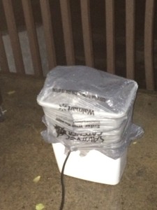
Back in October we had a couple of squall lines come through. On the 3rd, there was a significant event with two lines of storms. I had just been experimenting with measuring rainfall velocity with the modified X-band radar, so I decided to try another experiment. I put the radar unit in a trashcan and covered it with plastic bags. Then I sat it outside on our balcony and recorded for about 2.5 hours.

Testing the radar setup before the rain with some passing cars as targets.

Testing the radar setup before the rain with some passing cars as targets.

There is a radar in there! My make-shift rain proof radome. The only problem was a slight heat buildup after several hours of continuous operation.

There is a radar in there! My make-shift rain proof radome. The only problem was a slight heat buildup after several hours of continuous operation.

Not only do we get the doppler shift (i.e. velocity of the raindrops), but we get the reflected power. I'm not going to worry about calibrating this, but we can confidently say that the more (or larger) raindrops that are in the field of view of the radar, the more power will be reflected back.

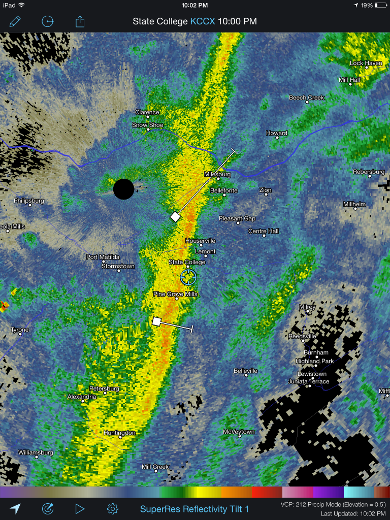
First, let's look at a screenshot of the local weather service radar. You can see my location (blue cross) right in front of the second line of showers. At this point we had already experienced one period of heavy rain and were about to experience another that would gradually taper off into a very light shower. This was one of the nicer systems that came through our area this fall.

A capture of our local weather radar, my location is the blue cross directly ahead of the storm.

A capture of our local weather radar, my location is the blue cross directly ahead of the storm.

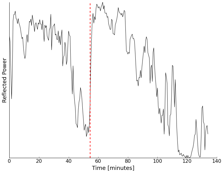
Now if we look at the returned power to the radar over time, we can extract some information. First off, I grouped the data into 30-second bins, so we calculate the average returned power twice per minute. Because of some 32-bit funny business in the computations, I just took the absolute value of the signal from the radar mixer, binned it, and averaged.

Reflected power received by the radar over time. The vertical red line is the time that the radar screen shot above was taken.

Reflected power received by the radar over time. The vertical red line is the time that the radar screen shot above was taken. We can see the arrival and tapering off of the storms.

From this chart we can clearly see the two lines of storms that came over my location. We also see lots of little variations in the reflected power. To me the rain-rate seemed pretty constant. My best guess is that we are looking at skewing of the data due to wind. This could be solved with a different type of radar, which I do plan to build, but that doesn't help this situation.

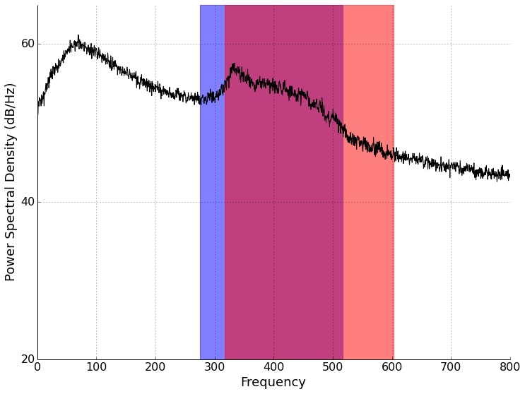
Let's look at what inspired this in the first place, the rainfall velocity. From a chart of terminal velocities, we can see that we expect to get drops falling between 4.03-7.57 m/s for moderate rain and 4.64-8.83 m/s for heavy rain. Taking a 5 minute chunk of data starting at 60 minutes into the data (during high reflectivity on the chart above), we can compute the doppler frequency content of the signal. Doing so results in the plot below, with the velocity ranges above shaded.

psd_velocity

Doppler frequency content of 5-minutes of data starting at 60 minutes into recording. The blue box shows doppler frequencies corresponding to moderate rain, and the red box corresponding to heavy rain.

Based on what I see above, I'd say that we fall right in line with the 0.25"-1" rain/hour data bracket! There is also the broad peak down at just under 100 Hz. This is pretty slow (about 1 m/s). What could it be? I'm not positive, but my best guess is rain splattering and rebounding off the top of my flat radar cap. I'm open to other suggestions though. Maybe part of this could be rain falling of the eve of the building in the edge of the radar view? The intensity seems rather high though. (It was also suggested that this could be a filter or instrument response artifact. Sounds like a clear air calibration may help.)

So, what's next? We'll take some clear-air calibration data and the use data from a Penn State weather station to see what the rain rate actually was and what the winds were doing. Maybe we can get a rain-rate calibration for this radar from our data. See you then!

Thank you to Chuck Ammon for discussions on these data!


Doppler On Wheels - A Tour of a Mobile Radar

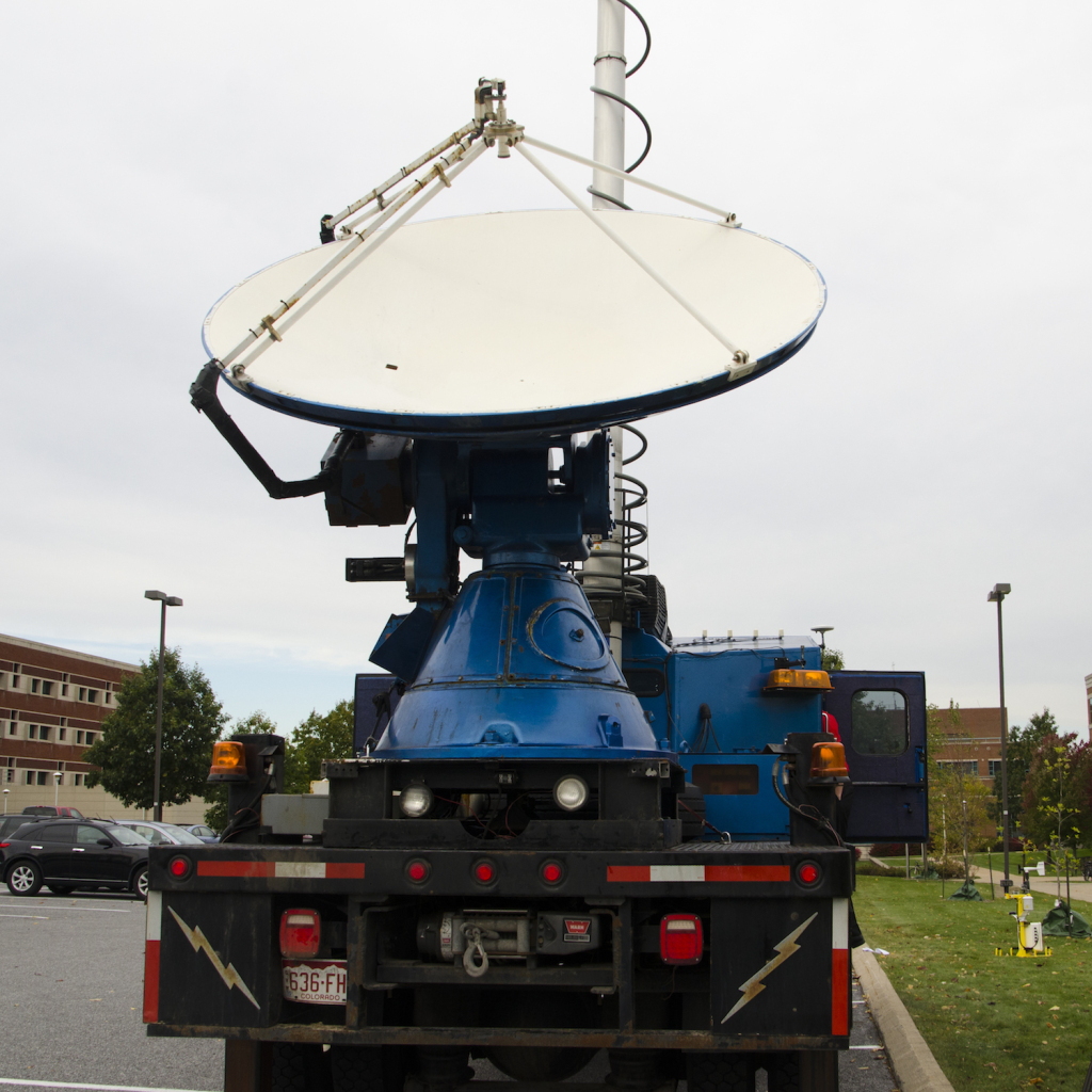
DOW7_Web

Recently, Penn State was lucky enough to have the "Doppler on Wheels" or DOW visit for two weeks through an NSF education grant! The truck, owned and operated by the Center for Severe Weather Research, is probably familiar to you if you have watched any of the storm chasing television shows or are interested in severe storms.  Dr. Yvette Richardson and Dr. Matt Kumjian were the faculty hosts and incorporated the radar into classes they are teaching.

I've always believed in getting students involved with data collection.  If students collect the data, they are attached to it and begin to see the entire scientific process.  Data doesn't just appear, real data is collected, often with complex instruments, and processed to remove various problems, corrections, etc.  It's not everyday that students get to collect data with a state-of-the-art radar though!

For this entry we're going to try a video format again.  Everyone seemed to like the last video entry (Are Rocks like Springs?).  Keep the feedback coming! It was a bit windy, but I've done what I can with the audio processing.  A big thanks to everyone who let me talk with them!  As always, keep updated on what's happening by following me on twitter (@geo_leeman).  This week I'll be off to New York to hear Edward Tufte talk about data visualization, so expect updates about that!

Doppler Radar at Home: Experiments with a CW Radar Part 1

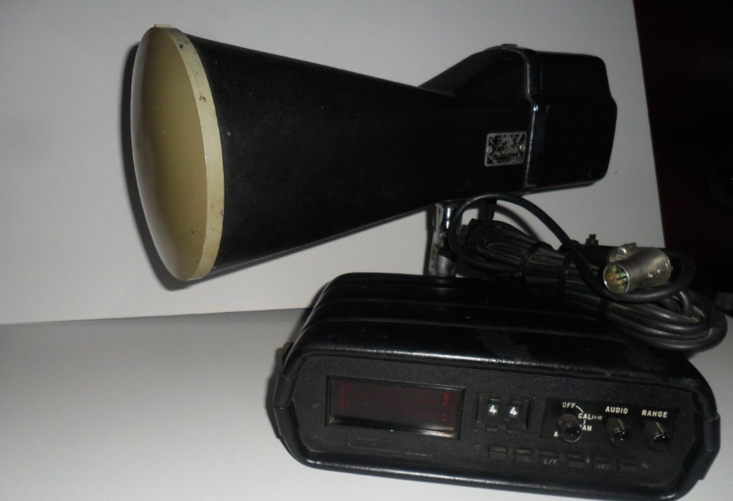
When you hear "radar", you probably think of weather radar and a policeman writing a ticket.  In reality there are many kinds of radar used for everything from detecting when to open automatic doors at shops to imaging cracks in concrete foundations.  I've always found radar and radar data fascinating.  Some time back I saw Dr. Gregory Charvat modify an old police radar on YouTube and look at the resulting signal.  I happened to see that model of radar (a 1970's Kustom Electronics) go by on EBay and managed to buy it.  I'm going to present several experiments with the radar over a few posts.  If you want to learn more about radar and the different types of radar I highly recommend Dr. Charvat's book Small and Short-Range Radar Systems.  I haven't bought a personal copy yet, but did manage to read a few chapters of a borrowed copy.

The doppler radar I purchased.  I'm not using the head unit.

The doppler radar I purchased. I'm not using the head unit.

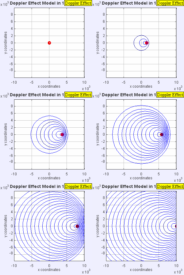
The radar I have outputs the doppler shift of a signal that is transmitted, reflected, and received.  Doppler is familiar to all of us as we hear the tone of a train horn or ambulance change as it rushes past us.  Since there is relative motion of the transmitter (horn) and receiver (your ears), there is a shift in received frequency.  Let's say that the source emits sound at a constant number of cycles per second (frequency).  Now let's suppose that the distance between you and the source begins to close quickly as you move towards each other.  The apparent frequency will go up because the source is closer to you each emitted cycle and you are closer to the source!

The doppler effect of a moving source.  Image: Wikipedia

The doppler effect of a moving source. Image: Wikipedia

This particular radar transmits a signal at a frequency of 10.25 GHz.  This outgoing signal is continually transmitted and reflected/scattered off of objects in the environment.  If the object isn't moving, the signal returns to the radar at 10.25 GHz.  If the object is moving, the signal experiences a doppler shift and the returned frequency is higher or lower than 10.25 GHz (depending on the direction of travel).  This particular radar can be easily hacked and we can record the doppler frequency out of a device called a mixer.  The way this unit is designed, we can't tell if the frequency went up or down, just how much it changed.  This means we don't know if the targets (cars) are coming or going, just how fast they are traveling.  Maybe in a future set of posts, we'll build a more complex radar system such as the MIT Cantenna Radar.  Be sure to comment if that's something you are interested in.

Since we'll be measuring speeds that are "slow" compared to the speed of light, we can ignore relativistic effects and calculate the speed of the object knowing the frequency change from the mixer, and the frequency of the radar.

Simplified doppler velocity.

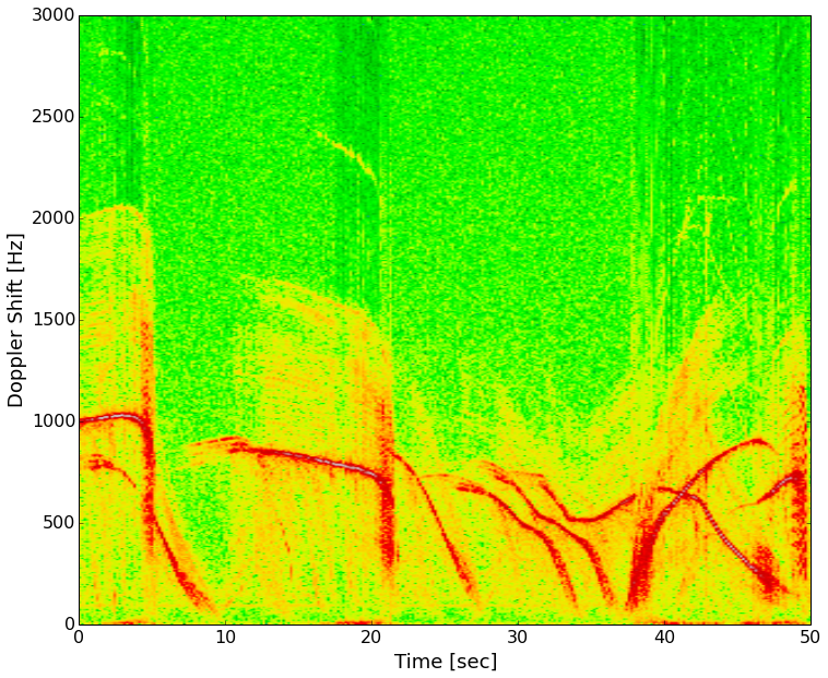
I took the radar out to the street and recorded several minutes of traffic going by, including city busses.  Making a plot of the data with time increasing as you travel left to right and doppler frequency (speed) increasing bottom to top, we get what's known as a spectrogram.  Color represents the intensity of the signal at a given frequency at a certain point in time.

Speeds of several cars on my street.  1000 Hz is about 33 mph and 500 Hz is about 16 mph.

Speeds of several cars on my street. 1000 Hz is about 33 mph and 500 Hz is about 16 mph.

The red lines are strong reflectors (the cars).  Most of the vehicles slow down and turn on a side street in front of the radar.  About 30 seconds in there are three vehicles, two slow down and turn, the third again accelerates on past.  Next I'll be lining up a video of these cars passing the radar with the data and you'll be able to hear the doppler signal.  To do that I'm learning how to use a video processing package (OpenCV) with Python.

In the next few installments, we'll look at videos synced with these data, radar signatures of people running, how radar works when used from a moving car, and any other good targets that you suggest!