Category Archives: Education Opportunity

How I Design a Talk

This year I'm co-chairing a session at the American Geophysical Union meeting called "Teaching and Career Challenges in Geoscience." We have been maintaining a blog for the session at keepinggeologyalive.blogspot.com. I wrote a post that I wanted to cross-post here in hopes that you too may find a few tips to help with the next presentation you need to give.

Hello everyone! While I was preparing my talk, I thought I would share my process in the hope that maybe someone will find a useful nugget or two. There are lots of great resources out there. Books like Pitch PerfectTalk Like TED, and the MacSparky Presentations Field Guide are great places to start. With AGU only a couple of weeks away, I wanted to highlight a few ideas on presentation planning.First, close PowerPoint or Keynote. The presentation software is not the place to start preparing a presentation. I like to sit down in a comfortable spot with a stack of index cards and a mug of coffee. While I love technology as a tool, it's just too early. I write out one major thought on the top of each card and put supporting material on as a list. For a short talk, like the pop-ups, this is just a few cards, but I've had stacks over 2 cm high for longer talks. I put everything I might want to bring up on these, pruning the content comes later.  After my cards are made, I lay them out on a big table (or the floor) and play with the ordering. I'll ad-lib sections of a fake talk and see if two thoughts can flow smoothly into each other. Once I'm happy with the general layout, then I'm ready to move on.

After playing with index cards, I'll let technology in. I like using OmniOutliner to help here. I put my index cards into a digital outline. Lots of people start here, which is fine. I like starting on paper because I can sketch things out and feel less constrained. Index cards also don't have email notifications that interrupt your thinking. In OmniOutliner, I break out my thoughts into short bullets. I can drag in content such as a photo of a sketch I think may turn into a graphic, sound bytes of an idea, or quotes I want to include.

Now it is time to decide on supporting graphics. I have an idea of what I'm going to say, so what visual aides will help tell the story? Your slides are not an outline and are not meant to guide you through the content. You and the slides together will guide an audience through your work in a logical way. Graphics can be photos, graphs of data, schematic diagrams, anything! Personally, I like make my graphics using an assortment of applications like PythonAdobe Illustrator, or OmniGraffle. Making graphics is a whole other series of books that you could dive into, including the great books by Nathan Yau: Visualize This and Data Points.

Finally, it's time to make your slides. I follow the Michael Alley approach of a slide with a (nearly) complete sentence at the top, followed by graphics. The fewer things that the audience has to read, the closer they will be listening to what you have to say. If you need to document your material to hand-out, produce a small one or two page text document with the necessary graphics (an idea from Edward Tufte). Again, the slides should not be the presentation, but support for it.  If you are stuck for ideas on slide design, head over to Garr Reynold's blog Presentation Zen. Garr has some great examples, as well as his own books.

My last tip regards the ends of your presentation. The beginning and the ending are incredibly important. The beginning is where you gain or loose the audience, and the end is where you make sure that their time was well spent. Nail these. I don't script presentations, it sounds too robotic, but the first and last 30 seconds are written down and well thought out.

I can't wait to hear what everyone has to share and I hope that some of these tips and resources are useful in your preparation!

Breaking the Wishbone - How to Win

The folks over at Michigan Engineering did some modeling, 3D scanning, and experimentation to tell us how to win at the age-old Thanksgiving game of breaking the wishbone. According to the folks over at aaepa.com, the tradition is much older than Thanksgiving, dating back over 2400 years to cultures that believed that birds were capable of telling us the future. There is even suggestion that the phrase "getting a lucky break" can be traced to this tradition.  If you want to win, watch the 76 second video below and remember: choke up, stay stationary, and pick the thick side.

We Are ... Seismic Noise

2014-10-28 13.27.05

Over the last few months construction crews have been hard a work tearing into the building adjacent to mine on the Penn State campus. Lots of demolition has been happening as the old building is completely cleaned out and being rebuilt. Some of the noise has been so strong that we could feel it next-door. As a data-nut, my first thought was "I'm going to look at this on our seismometer!"

At the base of Deike building (the geoscience building), we have a seismometer. The station, WRPS "We aRe Penn State", has been in operation on an isolated pier for some time, so we have lots of data to look at! For our purposes, I downloaded the entire month of October for 2013 and 2014. There are some hours/days that are missing, but we'll ignore those and work with what we have. This is a common problem in geoscience!

First let's just make a plot of this year's data. Each square represents one hour (24 squares in a row), and each row represents one day. Missing data is the lightest shade. The squares are colored by the strength of the seismic energy received during that hour; the darker the square, the more energy received.

WRPS_2014_HourlyYou'll immediately notice that there is always more noise starting about 11 UTC, which is the 7-8 AM hour locally. This is about when people are coming into work, vibrating the ground and buildings on campus as they do. The noise again seems to die off about 21 UTC or the 5-6 PM hour locally. This again makes sense with people leaving work and school. This isn't split finely enough to look for class change times on campus, but that could always be another project.

The other thing to point out is the dates of October 4-5,11-12,18-19,25-26. These are the weekends! You notice there is less of the normal daily noise traffic with fewer people on campus and construction halted. There is a repeating noise event at 11 UTC on the 1st, 12th, 20th, and 27th. I'm not sure what that is yet, but looking at more months of data may indicate if that event is associated with equipment starting up, or is really random.

While these daily life trends are interesting, they have been observed before. This whole discussion started with construction and how it was affecting the noise we saw on our local station. To examine this, I made a stacked power spectral density plot. Basically, this shows us how much energy is recorded at different frequencies. The higher frequencies would be human activity.

WRPS_PSD

We can see that the curves from 2013 and 2014 are very similar, with the exception of the 11-16 Hz range. In that range, the energy is higher in 2014 than in 2013 without construction by about a factor of 10. That range makes sense with construction activity as well! The energy remains elevated even after the main bump out to 20 Hz.

You might be thinking that such a bump could be due to anything. That's not necessarily true considering that we have stacked a month's worth of data for each curve. To show how remarkably reproducible these curves are, I made the same plot for the same times with a station in Albuquerque, New Mexico.

ANMO_PSD


In the Albuquerque plot, the two years are very similar, nothing like the full order of magnitude difference we saw in University Park. There are obviously some processing effects near 20Hz, but those are not actual signal differences, just artifacts of being near the corner frequency.

That's it for now! If there is interest, we can keep digging and look at signals resulting from touchdowns in football games, class changes, factories, etc. A big thank you to Professor Chuck Ammon as well for lots of discussion about these data and processing techniques.

Doppler On Wheels - A Tour of a Mobile Radar

DOW7_Web

Recently, Penn State was lucky enough to have the "Doppler on Wheels" or DOW visit for two weeks through an NSF education grant! The truck, owned and operated by the Center for Severe Weather Research, is probably familiar to you if you have watched any of the storm chasing television shows or are interested in severe storms.  Dr. Yvette Richardson and Dr. Matt Kumjian were the faculty hosts and incorporated the radar into classes they are teaching.

I've always believed in getting students involved with data collection.  If students collect the data, they are attached to it and begin to see the entire scientific process.  Data doesn't just appear, real data is collected, often with complex instruments, and processed to remove various problems, corrections, etc.  It's not everyday that students get to collect data with a state-of-the-art radar though!

For this entry we're going to try a video format again.  Everyone seemed to like the last video entry (Are Rocks like Springs?).  Keep the feedback coming! It was a bit windy, but I've done what I can with the audio processing.  A big thanks to everyone who let me talk with them!  As always, keep updated on what's happening by following me on twitter (@geo_leeman).  This week I'll be off to New York to hear Edward Tufte talk about data visualization, so expect updates about that!

Fun Paper Fridays

Image: phdcomics.com

Image: phdcomics.com

In my last post about why I think the expert generalist is crucial in today's highly inter-related world, I mentioned a practice that I've adopted of "Fun Paper Fridays."  Today I want to briefly describe fun paper fridays and invite you to participate.

The Routine
Every friday I go to a coffee shop first thing in the morning and commence my weekly review.  During this time I check the status of projects, emails, etc and make sure that things are not slipping through the cracks.  Those of you familiar with David Allen's Getting Things Done will recognize this.  In addition to reviewing my schedule, I added a self expansion project.

Each week I pick out a paper that isn't directly related to my research and read it.  The paper can be serious, just not about my work (ex: Viking Lander 1 and 2 revisited: The characterization and detection of Martian dust devils), or it can be a completely fun topic (ex: How to construct the perfect sandcastle).  That's it! Just read a paper, no notes unless you want.  You'll be surprised when in some situation you'll recall a fact, method, or comment from one of these papers and be able to apply it to a completely different scenario.

Join Me
I hope that you'll join me in this quest of broadening your knowledge horizons. If you're not involved with science, that's no problem. Just read something that you normally wouldn't. Maybe it's the Art & Culture section of a newspaper or an Article from a popular science magazine. Every Friday I'll be posting the paper I'm reading on Facebook and Twitter. Please join me and use the tag: #FunPaperFriday.

Mythbusting: Cooling a Drink with a Wet Paper Towel

While reading one of the many pages claiming to have "15 Amazing Life Hacks" or something similar, I found a claim about quickly cooling a drink that deserved some investigation.  The post claimed that to quickly cool your favorite drink you should wrap the bottle/can in a wet paper towel and put it in the freezer.  Supposedly this would quickly cool the drink, faster than just the freezer.  My guess is that the thought process says evaporative cooling is the culprit.  This is why we sweat, evaporating water does indeed cool the surface.  Would water evaporate into the cold, but dry freezer air? Below we'll look at a couple of experiments and decide if this idea works!

We will attack this problem with two approaches.  First I'll use two identical pint glasses filled with water and some temperature sensors, then we'll actually put glass bottles in and measure just the end result.  While the myth concerns bottles, I want to be able to monitor the temperature during the cooling cycle without opening the bottles.  For that we'll use the pint glasses.  

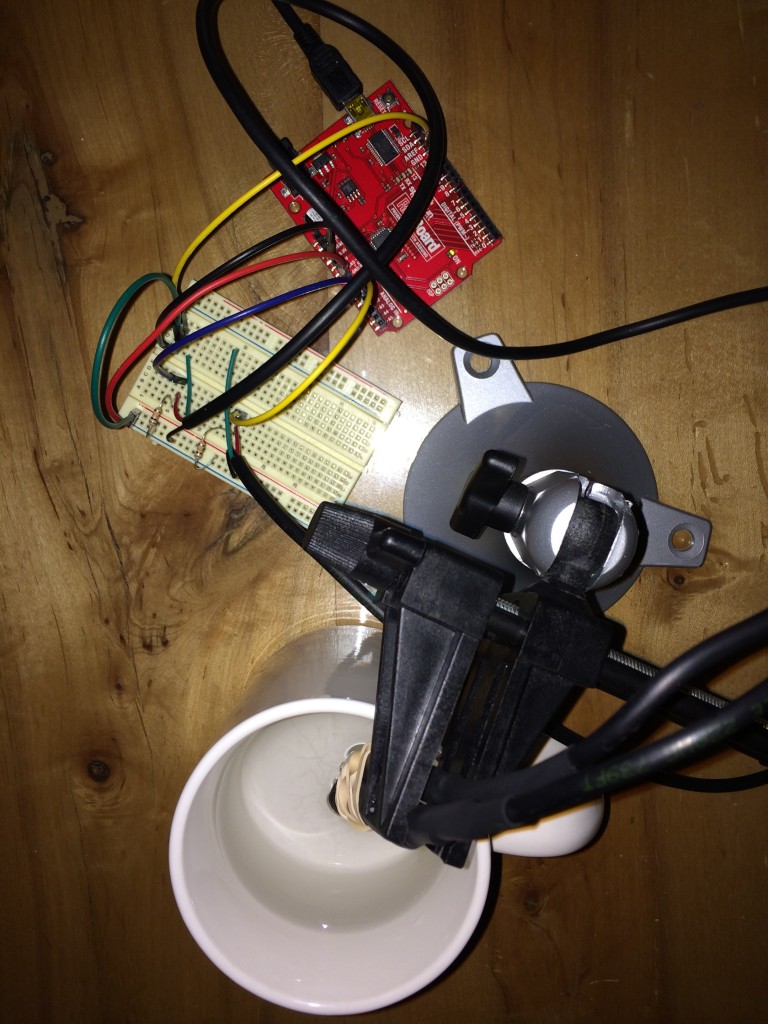
First I had to build the temperature sensors.  The sensors are thermistors from DigiKey since they are cheap and relatively accurate as well.  To make them fluid safe, I attached some three-lead wire and encapsulated the connections with hot-glue.  The entire assembly was then sealed up with heat-shrink tubing.  I modified code from an Adafruit tutorial on thermistors and calibrated the setup.  

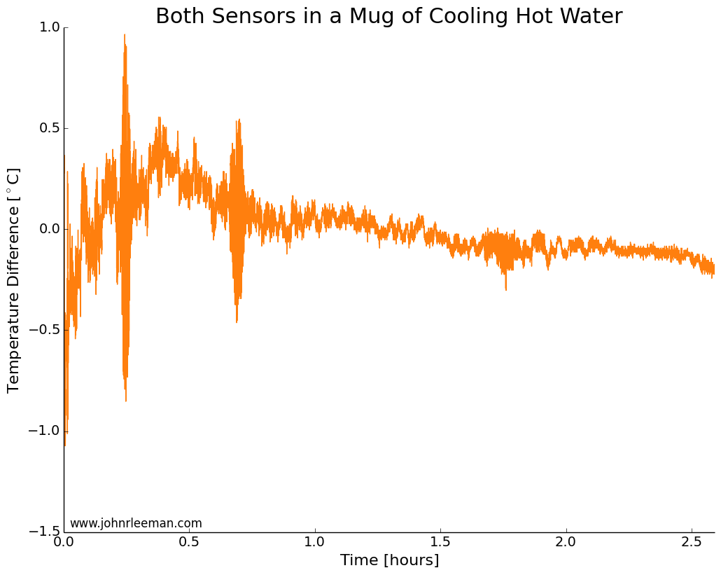
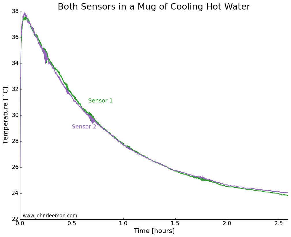
To make sure that both sensors had a similar response time, we need to do a simple control test.  I placed both probes in a mug of hot water right beside each other.  We would expect to see the same cooling at points so close together, so any offset between the two should be constant.  We also expect the cooling to follow a logarithmic pattern.  This is because the rate of heat transfer is proportion to the temperature difference between the water and the environment (totally ignoring the mug and any radiative/convective transfer).  So when the water is much hotter than the air, it will cool quickly, but when it's only slightly hotter than the air it will take much longer to cool the same amount.  

Mug Cooling Photo

Plotting the data, we see exactly the expected result.  Both sensors quickly rise to the water temperature, then the water cools over a couple of hours.  The noisy segments of data about 0.25 hrs, 0.75 hrs, and 1.75 hrs in are likely interference from the building air conditioning system.  

CoolingWater_AbsoluteTemps

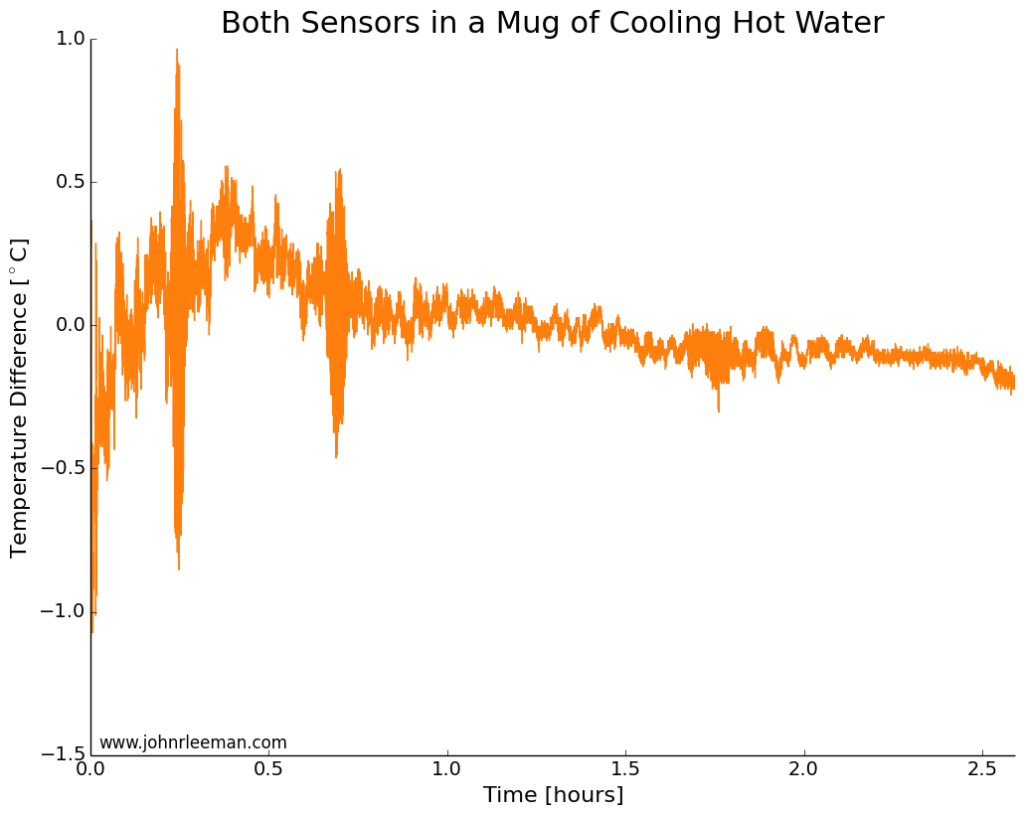
If we plot the temperature difference between the sensors it should be constant since they are sensing the same thing.  These probes look to be about dead on after calibration.  Other than the noisy segment of data, they are always within 0.5 degrees of each other.  Now we can move on to the freezer test.

CoolingWater_TempDifference

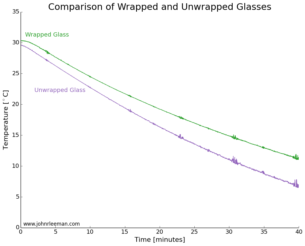
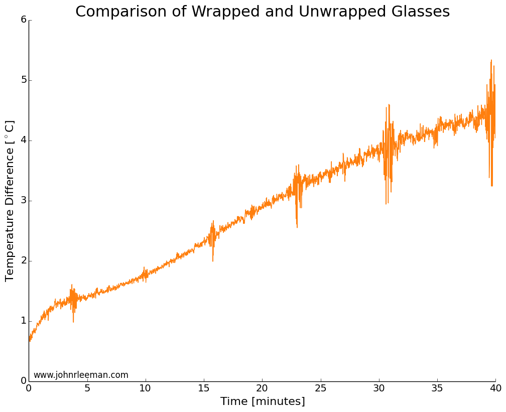
I used two identical pint glasses and made thermocouple supports with cardboard.  One glass was wrapped in tap water damped paper towel, the other left as a control.  Both were inserted into the freezer at the same time and the temperature monitored.  The water was initially the same temperature, but the readings quickly diverged.  The noisy data segments reappear at fixed intervals suggesting that the freezer was turning on and off.  The temperature difference between the sensors grew very quickly, meaning that the wrapped glass was cooling more slowly than the unwrapped glass.  This is the opposite of the myth! 

FreezingWater_AbsoluteTemps


FreezingWater_TempDifference

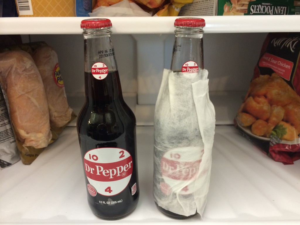
Next I placed two identical, room temperature bottles of soda in the freezer, again with one wrapped and one as a control.  After 30 minutes in the freezer, the results showed that the bottles and their contents were practically identical in temperature.  The wrapped bottle was slightly warmer, but it was within the resolution of the instruments (thermocouple and IR sensor).  I did this test multiple times and always got temperatures within 1 degree of each other, but not consistently favoring one bottle.

So what's happening here? Well, I think that the damp paper towel is actually acting as a jacket for the beverage.  Much like covering yourself when it's cold outside, the damp paper towel must be cooled, then the beverage can cool.  Adding that extra thermal mass and extra layer for the heat to diffuse through.  To provide another test of that hypothesis I again tested bottles with a control and a foam drink cooler around the base.  The foam cooler did indeed slow the cooling, the bottle being several degrees warmer than the control.

2014-08-13 17.56.28

The last question is why did the test with the glasses show such a pronounced difference, but the bottle test show no difference? My best guess is that the pint glass was totally wrapped vertically and that bottle had the neck exposed still.  Another difference could be the thickness of the towel layer and the water content of the towels.  

The Conclusion: BUSTED! Depending on how you wrap the paper towel it will either have no effect or slow down the cooling of your favorite drink.  

Let me know any other myths I should test! You can also keep up to date with projects and future posts by following me on twitter (@geo_leeman).

Arduino Code:

// which analog pin to connect
#define THERMISTOR1PIN A0
#define THERMISTOR2PIN A1
// resistance at 25 degrees C
#define THERMISTORNOMINAL 10000
// temp. for nominal resistance (almost always 25 C)
#define TEMPERATURENOMINAL 25
// how many samples to take and average, more takes longer
// but is more 'smooth'
#define NUMSAMPLES 15
// The beta coefficient of the thermistor (usually 3000-4000)
#define BCOEFFICIENT 3950
// the value of the 'other' resistor
#define SERIESRESISTOR1 9760
#define SERIESRESISTOR2 9790

int samples1[NUMSAMPLES];
int samples2[NUMSAMPLES];

void setup(void) {
Serial.begin(9600);
analogReference(EXTERNAL);
}

void loop(void) {
uint8_t i;
float average1;
float average2;

// take N samples in a row, with a slight delay
for (i=0; i< NUMSAMPLES; i++) {
samples1[i] = analogRead(THERMISTOR1PIN);
samples2[i] = analogRead(THERMISTOR2PIN);
delay(10);
}

// average all the samples out
average1 = 0;
average2 = 0;
for (i=0; i< NUMSAMPLES; i++) {
average1 += samples1[i];
average2 += samples2[i];
}
average1 /= NUMSAMPLES;
average2 /= NUMSAMPLES;

//Serial.print("Average analog reading ");
//Serial.println(average);

// convert the value to resistance
average1 = 1023 / average1 - 1;
average1 = SERIESRESISTOR1 / average1;

average2 = 1023 / average2 - 1;
average2 = SERIESRESISTOR2 / average2;
//Serial.print("Thermistor resistance ");
Serial.print(average1);
Serial.print(',');
Serial.print(average2);
Serial.print(',');

float steinhart;
steinhart = average1 / THERMISTORNOMINAL; // (R/Ro)
steinhart = log(steinhart); // ln(R/Ro)
steinhart /= BCOEFFICIENT; // 1/B * ln(R/Ro)
steinhart += 1.0 / (TEMPERATURENOMINAL + 273.15); // + (1/To)
steinhart = 1.0 / steinhart; // Invert
steinhart -= 273.15; // convert to C

Serial.print(steinhart);
Serial.print(',');

steinhart = average2 / THERMISTORNOMINAL; // (R/Ro)
steinhart = log(steinhart); // ln(R/Ro)
steinhart /= BCOEFFICIENT; // 1/B * ln(R/Ro)
steinhart += 1.0 / (TEMPERATURENOMINAL + 273.15); // + (1/To)
steinhart = 1.0 / steinhart; // Invert
steinhart -= 273.15; // convert to C(steinhart);

Serial.println(steinhart);
//Serial.println(" *C");

delay(1000);
}

Are Rocks like Springs? A Video Demonstration

Today I was getting a demo in the lab ready for a tour group and decided to try shooting a quick, unscripted bit on rocks as springs.  There are a few generalized statements in here, but overall it is a first try at a public education video.  Comments welcome!

Exploring Scientific Computing at SciPy 2014

Texas Campus

This past week I've been in Austin, TX attending SciPy 2014, the scientific Python conference.  I came in 2010 for the first time, but hadn't been able to make it back again until this year.  I love this conference because it gives me the chance to step away from work on my PhD and distractions of hobby projections to focus on keeping up with the world of scientific computing with Python.  I try to walk the fine line between being a researcher, engineer, and programmer everyday.  That means that it is easy to fall behind the state of the art in any one of those, and conferences like this are my way to getting a chance to learn from the best.

SciPy consists of tutorials, the conference, and sprints:

The first two days were tutorials in which I got to learn about using interactive widgets in iPython notebooks, reproducible science, image processing, and Bayesian analysis.  I see lots of things that I can apply in my research and teaching workflows!  Interactive notebooks are one of the last things that I was wishing for from the Mathematica notebooks.

The next three days were talks in which we got to see the newest software developments and creative applications of Python to scientific problems.  I, of course, gravitated to the geophysics oriented talks and even ran into some people with common connections.  It was during the conference that I gave my poster presentation.  I knew that the poster focused more on the application of Python to earthquake science than any earth-shaking (pun-intended) software development.  There were a few on the software side that wondered why I was there (as expected), but the poster was generally very well received.  Again I had several chance encounters with people from Google and other companies that had similar backgrounds or were just very interested in earthquakes!

The final two days (I'm writing this on the last day) were sprints.  These are large pushes to further develop the software while a critical mass of experts are in one location.  I'm still new enough to these massive open-source projections (on the development side at least) that I wasn't incredibly useful, but the reception of the developers was great!  Everyone was excited if you wanted to help and would spend as much time as needed to get you up and running.  During the sprints I've been following a fix for an issue that has recently caused problems in my plotting.  I also fixed a tiny issue (with help) and had my first pull request accepted.  For software people these are tiny steps, but for someone coming from just developing in-house purpose-designed tools.... it was an hit of the open-source collaboration drug.

Lastly, I worked on a project of my own during the evenings.  During the 2010 conference I worked with a friend to make a filter remove the annoying vuvuzela sound from the World Cup audio.  This year I've been making a fun earthquake visualization tool.  You'll be seeing it here on the blog, and may have already seen it if you follow me on twitter.  I learned a lot during this year's SciPy 2014, got to spend time with other alums of OU Meteorology, and meet some new folks.  Next on the blog we'll be back to some radar or maybe a quick earthquake discussion!

Gravitational Tricks: Lagrange Points and Orbiting at Puzzling Speeds

The orbital path of ISEE3 from launch to near present.

The orbital path of ISEE3 from launch to near present.

Last time I talked about a team trying to capture and reuse the ISEE3 satellite (here).  The team has received lots of telemetry lately, determined the rotation speed of the satellite, and even had an amateur radio operator receive the satellite!  While all of this is going on, they must rapidly plan out what orbit they wish to enter.  The most discussed orbit is termed ESL1, the Earth-Sun system Lagrangian point #1.  Lagrange points an interesting phenomena that I thought worth a short discussion.

When we think of orbits, traditionally we consult Kepler's laws.  These "laws" are 3 simple rules that were written down between 1609 and 1619 by Johannes Kepler.  I won't discuss them at length, because there are already many great sources to learn about Kepler's Laws and their application.  The thing we want to draw from them is that an object orbiting closer to the Sun (say Venus), will have to travel faster to satisfy the laws of nature.  In doing so it will orbit the Sun more times than the Earth will in the same amount of time.  Venus will in fact orbit the sun 1.6 times during 1 orbit of the Earth!

Let's say we place a satellite far away from the Earth, between the Earth and sun.  the satellite will orbit slightly faster than the Earth.  Over a period of time it will be on the opposite side of the Sun and we won't be able to communicate.  Eventually it will come around and lap the Earth! This isn't desirable, but we can use Lagrange points to solve this problem.

The simple laws of orbital mechanics that we have considered thus far are only valid for a simple problem with two objects (Earth and Sun or Earth and Satellite).  We have we three bodies though, the Earth, the Sun, and the satellite! Three body problems are generally sticky to solve, but we have an advantage.  The mass of a satellite is small compared to the mass of the Earth and the mass of the Sun (unless it's the Death Star).   We can ignore the small mass of the satellite as solve what is known as the restricted three body problem.  There are a few interesting points in space, the Lagrange points, at which the gravitational pull from the Sun and Earth are superimposed on each other to give the satellite the same orbital speed as the Earth!

The L1 point is where ISEE3 may end up, so let's look at it.  The satellite will be above the Earth at an altitude of 1.5 million km (932,000 miles), towards the Sun.  At this point, the two body mechanics say that the satellite will orbit the Sun faster than the Earth.  Adding in the complications of the three body problem, we see that the gravitational tug of the Earth towards the Earth,  away from the Sun is canceling out just enough of the Sun's pull to make the satellite orbit at the same angular speed as the Earth.  How useful!

There are other Lagrangian points as well (L2-L5), but we won't discuss them here, other than to say that a similar explanation can be given for each.  L4 and L5 are particularly interesting because they are inherently stable and hence lots of objects get caught there.  There are objects in Earth-Sun L4/L5 and Earth-Moon L4/L5.

Lagrange Points of the Earth-Sun system (Image: Wikipedia)

Lagrange Points of the Earth-Sun system (Image: Wikipedia)

Generally satellites are placed in a small orbit around the L1 point for several reasons, including that it isn't inherently very stable.  The ISEE3 team will have to execute a rather complex series of maneuvers to get to L1 again, using the pull of the moon and making a very close pass that comes within 10's of km of the surface of the moon.  Time is of the essence, as the longer the wait the more they must change the speed of the craft (referred to as Delta V in the engineering jargon).  The ship only has about 150m/s of Delta V left before it runs out of fuel.  It'll take up to 1/3 of that to reposition the satellite, depending on how long the team must wait.

That's the quick and dirty view of Lagrangian points.  I hope this was interesting and helps you understand space exploration, or your addiction to Kerbal Space Program a little more!

It's All About the Waves - 2014's First Magnitude 7+ Event in Chile

There's been a decent amount of chatter amongst Earth scientists that it has been a long time since the last magnitude 7 or greater earthquake.  In fact, there hadn't even been one in 2014 until last night.  The earthquake is currently rated an 8.2 (mww) and occurred in a well known seismic gap that has been published on a decent amount in recent years.  The last major earthquake in North Chile was an 8.6 in 1877! Many smaller earthquakes in the area over the last weeks have kept everyone on their toes.

This location in Chile marks a major plate boundary where the Nazca plate is subducting, or being pushed under the South American plate.  The idea of subduction is that the two plates are being forced together and one ends up getting pushed underneath the other.  In this case, the cold and dense oceanic crust gets pushed underneath the less dense continental crust.  As we would expect, this means that the earthquakes occur on a very shallow angle thrust.  Moment tensor solutions can tell us about the fault by analyzing many seismograms.  Turns out that the moment tensor solution looks like about a 12-18 degree dip on the fault, not out of line with our prediction.  There are a lot more of the advanced scientific products such as the moment rate function here.  It looks like the rupture lasted for around 100 seconds and slipped a maximum of 6.5 meters (21 ft.) at a depth of near 30 km (18.6 miles).  The earthquake started a little more shallow though, about 20 km (12 miles) down.

There have been many aftershocks with the event, some sizable.  At the bottom of the post I've provided a channel list that I'm using to watch the aftershock sequence on the EpiCentral app (for iPad).  What I want to show are the buoy data though!  When a large earthquake of this type occurs, waves are generated in the ocean and the folks at the Pacific Tsunami Warning Center go into action.  There were some significant waves near Chile (about 2m/6.5 ft.).  It looks like, for the time being, most other locations such as Hawaii may be in the clear.  As I'm writing this the remnants of the waves should reach Hawaii in the next few hours.  Below is a rough travel time map from NOAA.

ChileTsunamiTravelTime

A list of the observations from the  warning center can be found in their most recent statement.  We can actually access the buoy data and look at the wave propagating across the ocean though!

When waves propagate across the water (or many other media) they often experience a phenomena called dispersion.  The idea is that waves are actually made of many frequency components, or notes if you will.  Because of some physics funny business, the longer period (lower frequency) waves will actually travel faster than the short period (high frequency) waves.  We can see this in the data below.  I'm showing two stations for sealevel.  They have different types of sensors, but that's not too important.  Be sure to click on the plot to see it full size (the link will open in a new window/tab)!

Wave_dispersion

We see exactly what theory predicts, long period waves coming in first, followed by progressively shorter period waves.  We also see that stations further out don't see the high frequency waves.  This is another phenomena in which the medium filters out high frequency waves over the travel.  We would say that the high frequency waves have been strongly attenuated.

That's all for now! Thank you for sticking with me through some interesting observations of predictions from math and physics!

Channel List:
C;GO01; --;BHZ;VERTICAL,CHUSMIZA, CHILE
C;GO01; --;BHE;EAST-WEST, CHUSMIZA, CHILE
C;GO01; --;BHN;NORTH-SOUTH, CHUSMIZA, CHILE
IU;LVC; 00;BHZ;VERTICAL, LIMON VERDE, CHILE
IU;LVC; 00;BHE;EAST-WEST, LIMON VERDE, CHILE
IU;LVC; 00;BHN;NORTH-SOUTH, LIMON VERDE, CHILE
C;GO02; --;BHZ;VERTICAL,MINA GUANACO, CHILE
C;GO02; --;BHE;EAST-WEST, MINA GUANACO, CHILE
C;GO02; --;BHN;NORTH-SOUTH, MINA GUANACO, CHILE