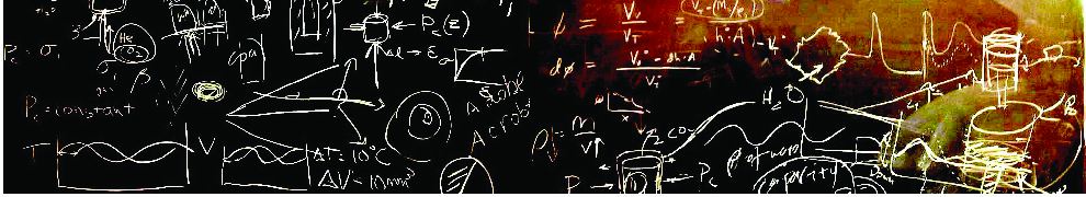
During this semester our lab group has been holding a weekly seminar in which everyone gets together to hear about the latest and greatest that other members of the group are doing. In a group with multiple professors and many students it is easy to lose track of what is happening in the lab on a daily basis! When organizing the meetings it was suggested that the presenter of each ~40-50 minute talk use only the chalk boards, no slides, no handouts. While there was much grumbling from the group, I was rather excited at the idea of giving such a "naked" talk, and it turns of so was one of the great physicists: John Wheeler. Wheeler was famous for going into the lecture hall before his talk and covering the chalk-boards with very nice color diagrams, then walking through them. Here I am going to discuss my attempt and giving a John Wheeler style talk, and why you should as well.
 |
| John Wheeler giving one of his famous talks with colorful hand-drawn illustrations. |
For my talk, I was going to be discussing electrical phenomena surrounding earthquakes such as radio emissions and earthquake lights. After some background I wanted to discuss some laboratory experiments I've done and propose a model to explain the data. A few challenges were immediately apparent:
1) I can't show exact data plots or scatter plots with many hundreds of data-points.
2) Showing photographs isn't an option.
3) There is no room for all the content that would have been in a slide presentation.
Having just attended a workshop by Michael Alley on "
The Craft of Scientific Presentation," many of these "challenges" resonated with things that presenters do, but shouldn't. We often overload our audience with information: many words on a slide, complex plots, and us speaking fast to beat the buzzer. We also depend on our slides to guide our talk instead of having the "story" and path well developed in our heads and just using the slides as visual aids. Dr.Alley even mentioned that one of his favorite slides is the plain black slide, because then the focus is on the presenter and their words.
In preparing the chalk-talk I thought about how to tell my story, wrote that down, then decided what visual aids would be helpful. I drew a sketch of those aids by the notes I had just made and then began cutting many of them. The drawings on my paper would have taken the chalkboards in the room times two! I didn't want to erase anything and draw in real-time for two reasons: it wasted time that we could be talking about science and it didn't let me draw intricate diagrams. In the end I drew the final set of diagrams on a separate piece of paper and only had one word list in the introduction to help make a point about the diversity of natural observations.
The morning of the talk I went to the room about an hour before people would be arriving with two boxes of chalk (one plain white and one of many colors). I spent the hour drawing the figures, erasing, drawing again, refining, removing, etc. Drawing some data plots was difficult, but let me get away from the audience worrying about noise and other artifacts. By being able to emphasize the important points in the data it made the plots less confusing for the audience.
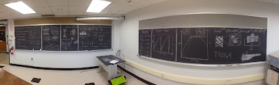 |
| The entire talk. I walked around the boards and presented for about 50 minutes. |
During the talk I just walked down the boards and talked through the points I had outlined without bulleted lists. Doing so I noticed a few things:
- The audience eye-contact was just incredible. Instead of looking at my slides and reading words, examining detailed plots, or other distractions there was a lot of focus on the topic matter.
- The style of the presentation was very relaxed and let me steer the talk dynamically. Unlike slides that fix you into a path from the moment you click "Show Presentation," I could adjust the level on-the-fly as the audience showed interest or got lost.
- Making the diagrams made me notice things in my data when looking for ways to simplify it.
- Preparing for this talk I learned where gaps in my knowledge were because I refused to rely on pulling figures directly from a paper as we often do in making slides.
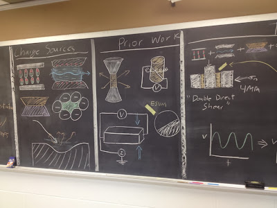 |
| My attempt at summarizing about 20 minutes of talking points in diagrams alone. |
Overall the talk was very well received and I got some great feedback on the research. The biggest drawback was also one of the advantages: plots. Though my simplified drawings made understanding easier for the audience, my drawing skills also caused some questions that were on "artifacts" in my art skills, not the data. When drawing a time series, making sure things were precisely lined up was a bit tricky, but showing a real plot would probably introduce more confusion due to the complication.
Next time you have to give a talk to a small group in a classroom you should try a chalk-talk! They are simple and I think you'll be pleasantly surprised at both your own understanding and the reaction and engagement of the audience. If you do, let me know how it goes!